User manual & case studies
The Structura manual
Practical methods, workflows, and tips based on real-market examples - the complete guide to reading structure, momentum, and trend in one disciplined process.
Updated for the Structura relaunch · July 2026 · formerly the TrendGo manual
Jump to section
PRISM · AI MARKET STRUCTURE ASSISTANT
Prism - AI market structure assistant
What Prism is
Prism is an AI assistant that reads every Structura layer on your chart - and the layers we do not publish - and writes the read. It reads Accumulate, Divergence, Blocks, Horizon, Pulse, Sentinel, Liquidity and Squeeze. A human can hold two or three of those readings at once. Prism holds all of them, on several timeframes, and tells you where they agree, where they conflict, and what is blocking a cleaner picture.
How to ask
Open prism.structuramarkets.com and log in with the email you subscribe with. Ask in plain language. The shortest useful question is a symbol and a timeframe: XAUUSD 4H. Add a second timeframe to get the conflict between them: XAUUSD 4H, 1D. Ask about a list: Read my watchlist. Which ones have nothing to say right now? Ask what changed: What moved on SPY since yesterday?
What the read contains
Every read follows the same structure, so you always know where to look:
- As of - the last closed candle used for each timeframe, so the read can be checked against the chart.
- State - what each visible layer says, per timeframe, in the same numbers you see in the panel.
- Agreement - which layers and timeframes agree, which do not. Readiness lives here.
- What is blocking a cleaner read - one thing, not a list.
- What would change the read - conditions you can verify on the chart, in both directions. Never a price forecast.
- Since last read - what moved, and whether it is a real change or noise within the same configuration.
- Prism's own note - the only place for interpretation, marked as such. This is where the unpublished layers enter, without names.
- Summary - three to five lines: state, what is blocking, what must change.
Readiness
Readiness is how much of the system agrees, and how strongly. It is not a probability and it is not a forecast. Forty means the layers are split; eighty means they are pulling the same way.
When the layers are quiet
Prism says so. A read on a chart where nothing is happening is short: the state of each layer, and the sentence “Nothing is blocking. The layers have no structural read on this instrument right now.” That is a complete answer, and it is one most tools are not built to give.
Voice, watchlist, alerts
Every read can be listened to in the voice you know from the Sunday Read. You can keep a watchlist and ask Prism to read all of it at once, and you can have it tell you when a read on a symbol changes.
What Prism will not do
It will not say buy, sell, long or short. It will not give you an entry, a stop or a target. It will not build a narrative when the layers are silent. It reads the system; what you do with the read is yours.
Plans and limits
Prism is included in Vector and Vantage. Each plan has a daily reading allowance; when it is used up, Prism tells you and the allowance resets the next day.
Prism's output is generated by an AI system from Structura's layer data. It is educational analysis, not financial advice, and it can be wrong. It never tells you to buy or sell.
The system
The framework: Structure → Momentum → Trend
Structura maps the cycle every market moves through - accumulation, compression, expansion, exhaustion, reset - in three layers, each answering one question in order. The tools in this manual are the layers of that single workflow.
| Layer | Tool | The question it answers |
|---|---|---|
| Structure | Accumulate | Where is the market positioning, quietly, before the move? |
| Momentum | Horizon | Is momentum compressing or expanding? |
| Trend | Pulse | Is the trend confirming, or weakening? |
| Scan | Sentinel | Where across the whole market are these conditions appearing right now? |
We don't produce isolated signals. We map process - the goal is not to replace judgment, but to improve clarity, context, and decision quality.
Momentum layer
Horizon - how to interpret it
Horizon reads the momentum condition behind price, helping traders understand whether the market is washed out, recovering, overheated, or weakening.
See the Horizon tool page for what it reads and what it will not do.
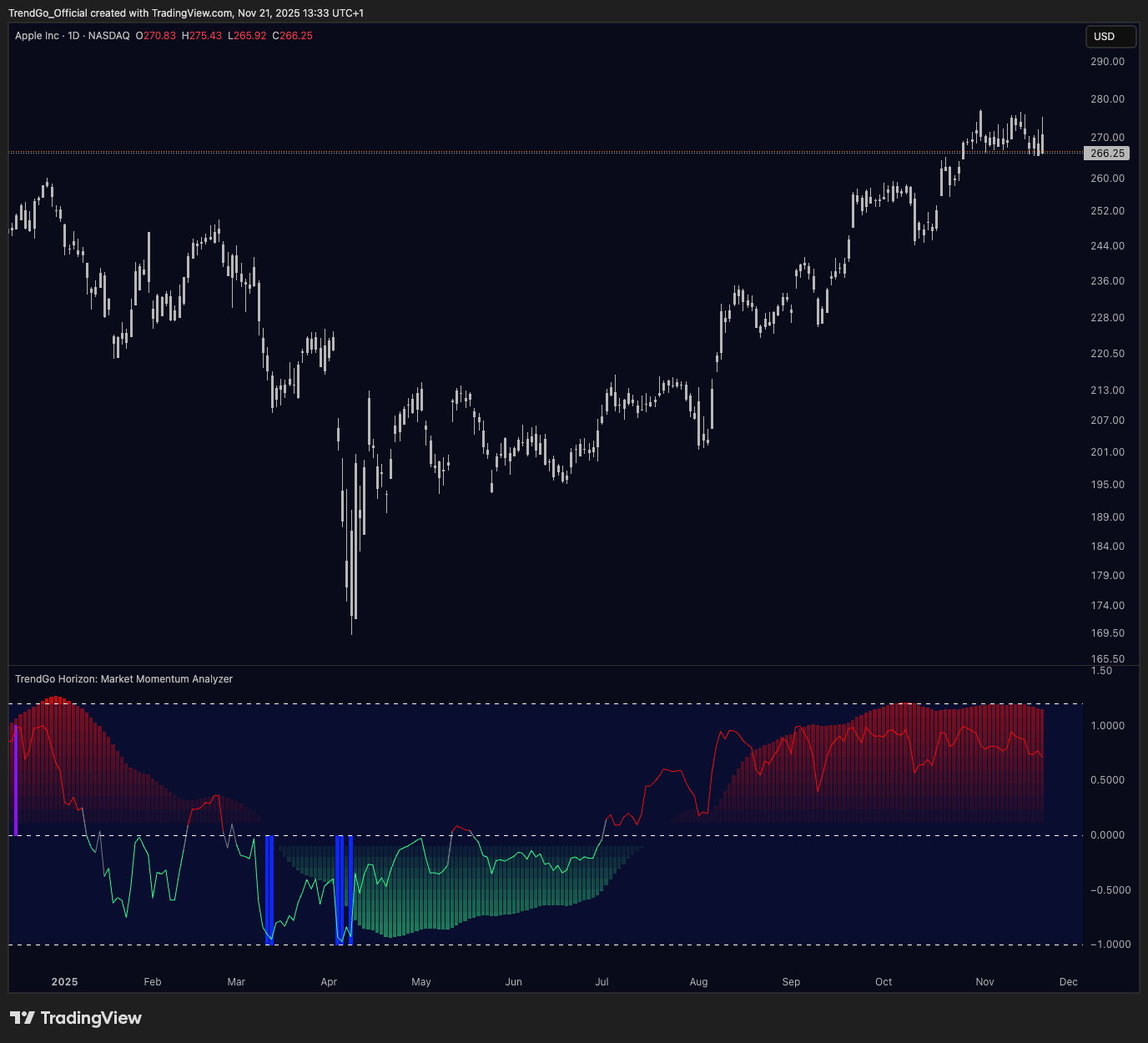
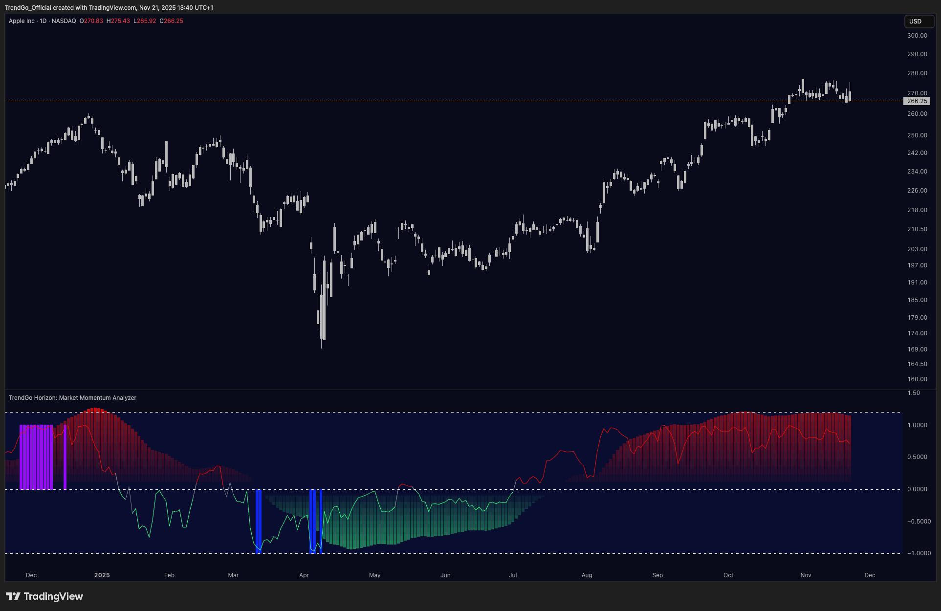
Color histogram - current market momentum
- Red histogram - increasing momentum towards a potential bearish reversal (overbought area approaching).
- Green histogram - decreasing momentum towards a potential bullish reversal (oversold area approaching).
- Intense colors (deep red / deep green) indicate potential overbought or oversold market conditions.
Horizontal white lines - key boundary levels
- Upper line: overbought level - potential downward reversal zone.
- Lower line: oversold level - potential upward reversal zone.
Vertical confirmation lines - entry into critical zones
- Purple lines confirm potential overbought areas (possible downward reversal).
- Blue lines confirm potential oversold areas (possible upward reversal).
Divergence signals
- Bullish divergence: price makes a lower low, but Horizon makes a higher low - potential upward reversal.
- Bearish divergence: price makes a higher high, but Horizon makes a lower high - potential downward reversal.
Trend behavior layer
Pulse - how to interpret it
Pulse detects changes in trend behavior by visualizing constructive or deteriorating market behavior directly on price.
See the Pulse tool page for what it reads and what it will not do.
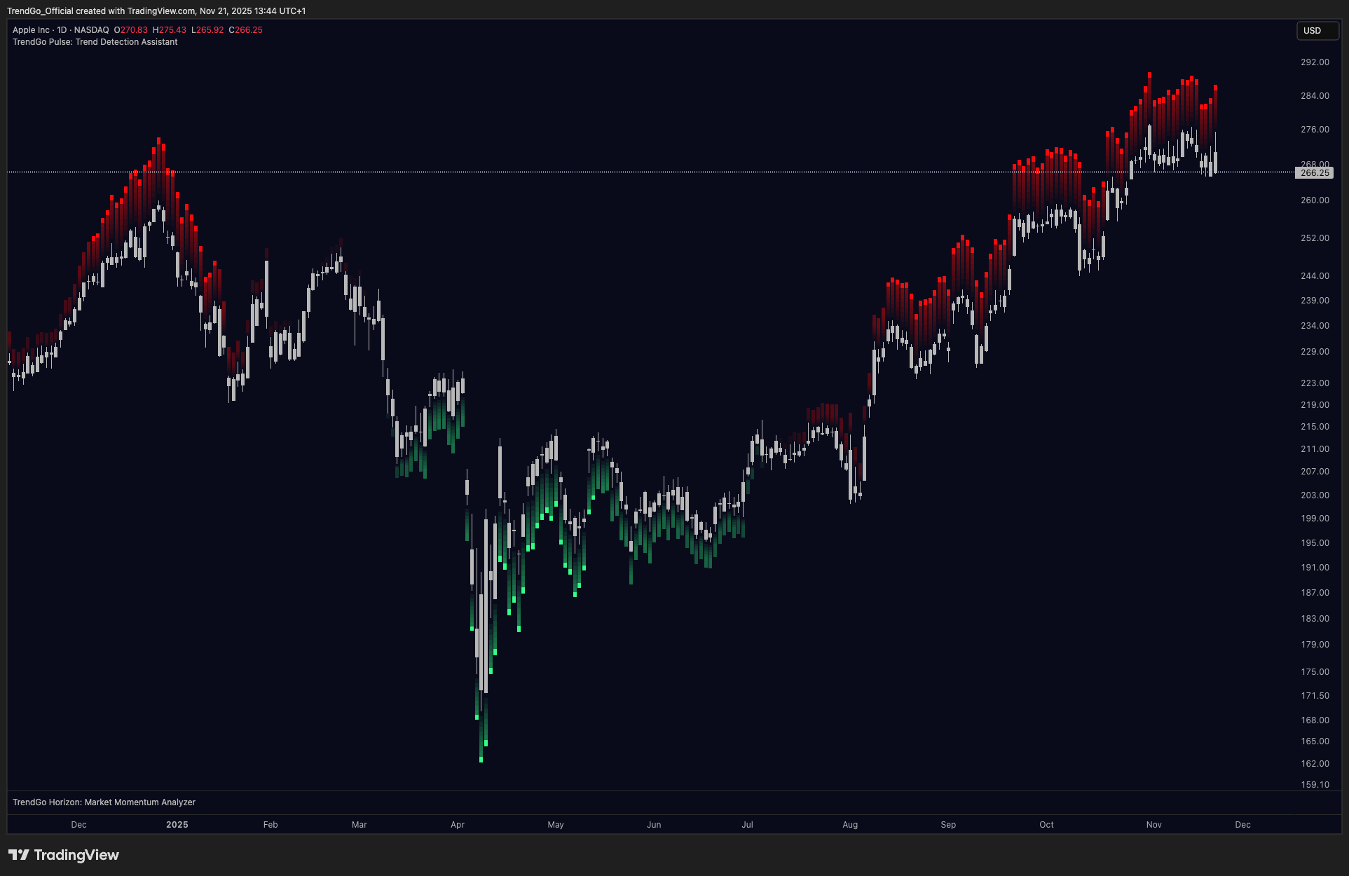
Dots on the chart
- Green dots below candles - constructive trend behavior. The market is behaving in a way consistent with continuation.
- Red dots above candles - deteriorating / defensive trend behavior. The market is showing signs of weakening.
How to read Pulse in context
- Green dots appearing after Accumulate + Horizon recovery = stronger confirmation of transition.
- Red dots after extended move = possible trend exhaustion or distribution behavior.
- Pulse alone is not an entry signal - it is a trend behavior confirmation layer.
Pulse + Horizon combination
- Horizon oversold + Pulse green dots = momentum recovery with constructive behavior.
- Horizon overbought + Pulse red dots = momentum exhaustion with deteriorating behavior.
- Both confirming = higher-quality setup context.
Scanning layer
Sentinel - how to use it
Sentinel reads selected markets and timeframes for structural, momentum, and trend behavior conditions, helping traders decide where analysis should focus next before opening individual charts.
See the Sentinel tool page for what it reads and what it will not do.
What Sentinel shows
- Scanner table with market condition overview
- Timeframe context across your watchlist
- Watchlist-level structure and momentum states
- Markets where conditions are aligning across layers
How to use Sentinel
- 1Open Sentinel before starting your chart session.
- 2Identify which markets are showing structural, momentum, or trend behavior conditions worth investigating.
- 3Prioritize those markets for detailed chart work.
- 4Use it as a market awareness layer - not as a trading signal.
Market Intelligence Dashboard
Sentinel surfaces four integrated views that together form a complete market awareness layer. Each panel answers a different question before you open a single chart.
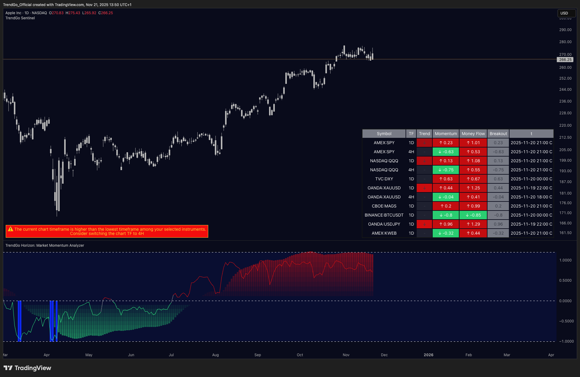
The scanner table gives you a ranked, at-a-glance read across your entire watchlist. Each row shows the current structural status, momentum direction, trend score, money flow reading, and breakout context - so you can immediately identify which markets deserve deeper chart work.
The Live Structure Workflow panel breaks down the current reading into six scored layers: Structure, Volatility, Momentum, Trend, Money Flow, and Expansion. Higher scores across more layers indicate stronger alignment - giving you a fast quality check before committing to analysis.
The Structure Zone panel labels the current structural phase in plain language - such as "Distribution before decline" or "Preparation before expansion" - and shows the bullish/bearish percentage split. This gives you an immediate directional bias read without needing to interpret the raw indicator values.
Reading the Sentinel table
Screenshots may show pre-v1.1 state names; the current names are listed in the reference below.
| Column | What it means |
|---|---|
| Status | The market's phase. Every monitored symbol is always in exactly one state: Active (fully confirmed long-side condition), Contraction (fully confirmed short-side condition), Recovering (price at support/bottom zone; constructive conditions forming - sticky until opposite zone triggers), Distributing (price at resistance/top zone; distribution phase underway - sticky, can persist through a decline until opposite zone fires), Rebuilding (no structural zone active, momentum below neutral: market gathering energy without a defined base), Neutral (no structural signal and no strong momentum reading). |
| Momentum | Price's position inside its recent range on a −1 to +1 scale (above zero = upper half), with a direction arrow versus the previous bar. Read together with Status: agreement means the phase has fuel; disagreement means the story may be changing. |
| Trend | A 5-block strength bar of directional pressure. More filled blocks = stronger trend pressure on that side. |
| Money Flow | How extended price is from its own mean, with direction. Large values = stretched; near zero = equilibrium. |
| Breakout | Marks the moment price crosses the midpoint of its range, switching between the support half and the resistance half. During an active breakout the cell shows the live momentum value in color instead of a neutral dot. |
| t | Timestamp of the last processed bar (live or confirmed close, depending on the "Use live bar" setting). Always glance at it before trusting a row. |
| Row highlights | A row gains a background tint when a new event just occurred (new trend state, breakout, or active condition) and fades when the condition resets. Highlights are the table's built-in triage: look there first. |
The reading ritual (90 seconds)
Scan the Status column vertically for the map - find rows where Status and the Momentum arrow disagree - check timestamps - open one chart: the row with the most tension. Everything else stays in the table. The discipline of not opening twenty charts is the point of the tool.
Workflow HUD
Shown for the active chart symbol only, the Workflow HUD scores six readiness dimensions from 0–100%: Structure (confirmation build-up), Volatility (compressed vs expanding), Momentum, Trend (progress toward confirmation), Money Flow (extension from mean), and Expansion (composite readiness - 100% means all gates confirmed). The Zone label beneath it summarises the current structural context: Expansion Zone (confirmed long-side), Contraction Zone (confirmed short-side), Structure Zone (preparation or distribution phase), Pre-Expansion (neutral).
Alerts
Sentinel can notify on: trend state changes, breakouts in either direction, and full Long/Short Confirmations. Alerts are reminders to review the chart - a fired alert is never an instruction to trade. Alert payloads are available as plain text or structured JSON for automation workflows.
As with every Structura tool: Sentinel maps process, not predictions. A flagged condition means “review this chart,” never “open a position.”
Structure layer
Accumulate - how to interpret it
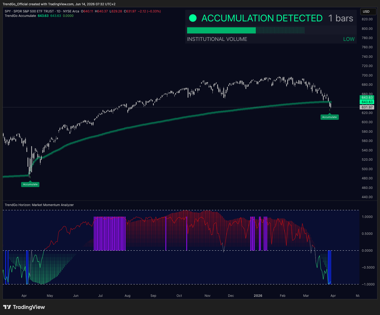
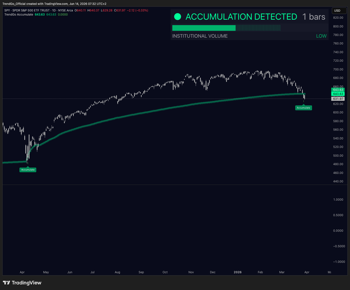
Accumulate identifies structural areas where price may be stabilizing, rebuilding, or reconnecting with its long-term market structure after a reset.
See the Accumulate tool page for what it reads and what it will not do.
The structure curve
- Price near the curve = market is reconnecting with structure.
- Price stabilizing around the curve = structure may be rebuilding.
- Price far above the curve = price may be extended from structure.
- Price below the curve = structure is not fully reclaimed yet.
Accumulate zones
- Zones where the market is showing signs of structural positioning.
- Areas where institutional volume context suggests rebuilding.
- Distance from structure as a measure of extension or compression.
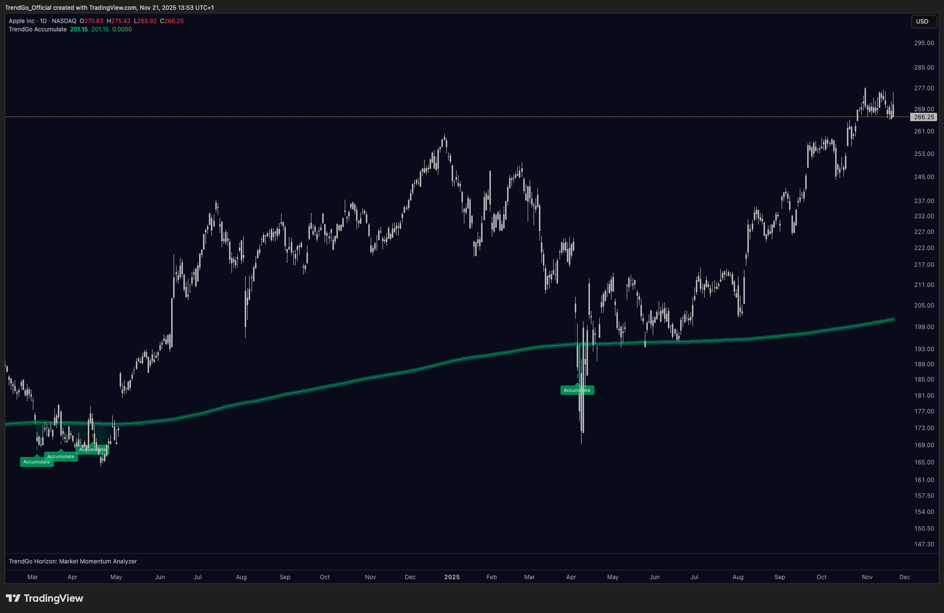
Reading the structure curve in practice
- Use the curve as a reference point, not a precise entry level.
- Price repeatedly reacting around the same structural area = stronger structural significance.
- Combine with Horizon and Pulse for entry timing context.
Structura Divergence
Divergence — how to interpret it
See the Divergence tool page for what it reads and what it will not do.
What it does
Divergence detects disagreements between price and momentum - moments when a new price extreme is not confirmed by the engine underneath it. Momentum is measured against a volume-weighted baseline (VWAP-anchored), which makes the reading participation-aware: it reflects where actual business was transacted, not just where price traveled.
It marks two families, each on its own confirmed pivot set:
- Regular divergences - price prints a higher high while momentum prints a lower high (bearish), or price prints a lower low while momentum prints a higher low (bullish). The visible move is losing its engine.
- Hidden divergences - during a pullback, momentum resets deeper than price (bullish), or during a bounce it recovers less than price (bearish). The underlying phase may be stronger than the correction suggests.
Each detection carries a strength label - a grade of how pronounced the disagreement is. A strong label is a louder condition, not a better signal; treat it as priority for review, nothing more.
How it draws
Detections anchor to confirmed pivots only - a pivot must be fully formed, with closed bars on both sides, before Divergence connects it to anything. Highs and lows are tracked as separate pivot streams, so bullish and bearish structures never contaminate each other. The practical consequence: nothing repaints. A line you see today will be in the same place tomorrow, next week, and in your review of past charts. The cost of that honesty is patience - Divergence marks conditions slightly later than tools that draw on unconfirmed pivots and then quietly erase their own work.
How to read it
A marked divergence is a condition, not a conclusion. It documents that price and momentum disagree - it does not tell you which one wins. A working sequence:
- 1Structural context first. A bullish divergence printing into an Accumulate zone is a different situation from the same divergence in open space. Layers confirm each other - or they don't, and that disagreement is information too.
- 2Confirmation layers. Divergence can be cross-checked against RSI behaviour and on-balance volume: a momentum divergence that participation refuses to echo deserves more skepticism than one confirmed across layers.
- 3Respect the timeframe hierarchy. The tool reads across multiple timeframes; a 4H divergence is a comment about days, a weekly one about months. Never read a lower-timeframe divergence as an argument against a higher-timeframe phase.
- 4Wait for the market's answer. Divergence names the tension; acceptance or rejection at the relevant level resolves it. The tool's job ends where your judgment begins.
What it does not do
- It does not predict reversals - it documents disagreement.
- It does not generate entries, exits, targets, or signals of any kind. Strength labels grade the condition, not the trade.
- It does not repaint, recalculate, or improve its history.
- It stays quiet when no pivot qualifies - silence means "nothing qualified", not "nothing happening".
Access
Divergence is free, alongside Structura Accumulate: one signup at /free-tools (email + TradingView username), access on your TradingView account within 24 hours. Chart → Indicators → Invite-only scripts.
Free tool
Structura Blocks — Manual
How Structura Blocks marks imbalance zones, why filled zones stay on the chart, and what the layer will never tell you.
See the Blocks tool page for what it reads and what it will not do.
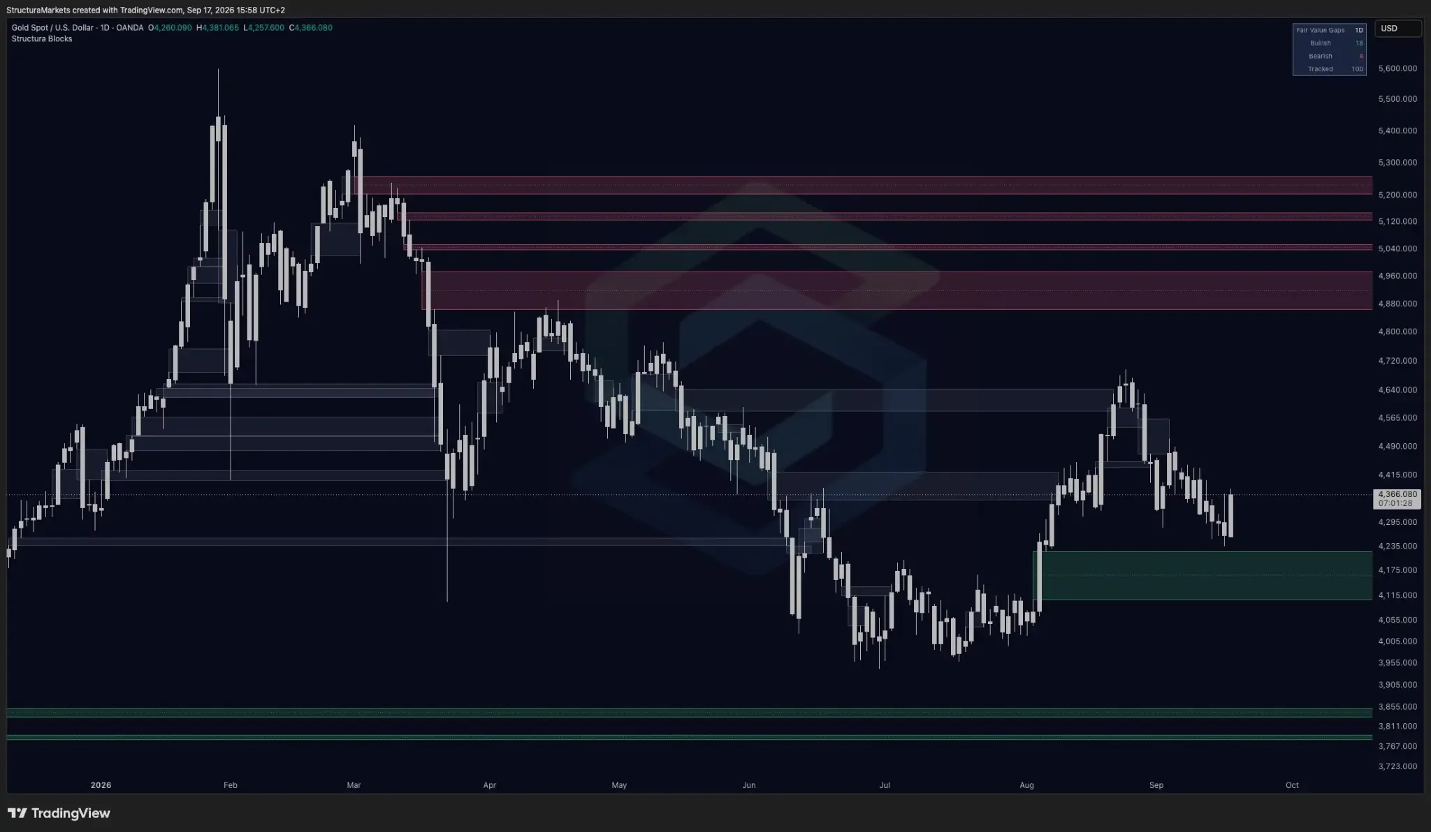
What Blocks marks
Price moves because one side runs out of participants. In an orderly market, buyers and sellers meet across a range and every level gets tested. Sometimes that does not happen — a large participant needs to move size, a number is released, a position is liquidated — and price relocates instead of negotiating, skipping a band of levels on the way.
Blocks draws that band. On a candlestick chart it is identified with three consecutive candles: when the middle candle moves far enough that the wick of the first and the wick of the third do not overlap, the space between them is the zone.
How to read a zone
Width is age. A zone starts where the imbalance formed and extends to the right for as long as it goes untouched. You do not have to be told how old a gap is; you read it off the chart. A zone that formed this morning and one that has been sitting there for seven months look completely different, because they are.
Grey means resolved, not deleted. When price finally trades back through a zone, it turns grey and stays. Most tools delete a zone at that moment, which leaves you looking at a chart that has quietly edited its own history — only the currently open gaps, no record of what happened to the rest. We keep them, because a record you can only see when it flatters the tool is not a record. The grey zones are what let you judge the live ones.
Colour is direction of formation, not direction of expectation. A zone formed on the way down and a zone formed on the way up are marked differently so you can tell them apart. Neither is a forecast.
Three questions the layer is built to answer
Where is a zone relative to price, above or below, and how far. How long it has been there. And whether it has already been resolved.
That is the complete list. Everything else on your chart is a different question and needs a different layer.
What Blocks will never tell you
That a gap gets filled. Not whether, not when, not how far.
This is not a limitation we are apologising for. You will find material elsewhere quoting a specific percentage of gaps that get filled; treat those figures carefully, because the number depends entirely on what counts as a fill, over what window, on which instrument and timeframe, and which gaps were in the sample. Change any one of those and the answer moves a long way.
Blocks marks where the market left something behind and stops there. What happens next is not a question an indicator gets to answer.
Common mistakes
- Treating an unfilled zone as a target. The zone records where the market relocated without negotiating. It makes no claim about being reached.
- Treating a fill as a signal. Price trading back through a zone is an event, not an instruction.
- Dropping to smaller timeframes for more zones. A five-minute chart produces far more of them than a daily chart, and almost all of that extra supply is noise.
- Using it alone. Blocks describes one narrow property of price behaviour and is silent on everything else.
Getting it
Blocks is public on TradingView. Open the script page, add it to your favourite indicators, and it appears in your Indicators list under Favourites. No invite, no card, no feature gates.
Open Structura Blocks on TradingView →
Further reading: What is a fair value gap?
Educational market commentary — not financial advice.
Liquidity layer
Liquidity — the levels the market keeps returning to
See the Liquidity tool page for what it reads and what it will not do.
What it marks
Liquidity finds confirmed swing highs and lows and turns each into a zone: a box sized to current volatility, drawn around the swing that created it, extended to the right for as long as it holds. Support zones are green, resistance zones are red.
One zone per level
When a new swing forms close to an existing zone, it is treated as a revisit of that zone and the zone's touch count goes up. A level tested five times is one zone with five touches, not five lines. When price closes cleanly through a zone, the zone is removed - it is no longer liquidity, and leaving it on the chart would misrepresent the picture.
What you see
Only the nearest zones on each side of price are drawn; the rest are tracked and appear as price approaches them. The panel shows how many zones are on the chart, how many are tracked, and the nearest support and resistance prices.
How to read it
Price at a green zone is at a level that has held before. Price at a red zone is at a level that has capped price before. Neither is a signal; both are conditions to review with the other layers. A zone appears a few bars after the swing that forms it - swings are confirmed only once subsequent bars have printed, which is why nothing here repaints.
What it will never tell you
Whether a level holds. Plenty do not. Liquidity does not draw targets, does not mark entries, and does not say which way price goes from a level.
Settings
Swing sensitivity · zone width and merge distance, both relative to volatility · zones shown per side · maximum distance from price · optional volume filter · labels and panel. Defaults are meant to be read, not tuned.
Educational market commentary - not financial advice.
Volatility layer
Squeeze — compression, release, and the momentum through both
See the Squeeze tool page for what it reads and what it will not do.
What it marks
Squeeze identifies the periods when volatility contracts - one volatility envelope sitting fully inside another - marks the moment that compression ends, and reads momentum through both phases.
Strict compression
Compression is only called when both edges of the inner envelope sit inside the outer one. A single-side overlap is shown as a separate, in-between state, not as a squeeze. This is why the compression bands on a chart are few and clean.
What you see
A separate pane. A momentum histogram: green when positive and building, cyan when positive but slowing, red when negative and falling, pink when negative but recovering. Along the zero line, dots: red while compression is on, green when it has just released, grey in between. The pane background tints during every compression, so a squeeze reads as a band, not a dot. The panel names the state and the momentum direction.
How to read it
Red dots and tint: the market is quiet; volatility has contracted. Green dots: the quiet phase has released. Grey dots: neither - do not read it as a squeeze. The histogram color is the momentum regime. Movement toward or through the zero line means momentum is shifting; it is not a signal on its own.
Alerts
Compression started · compression released · released with positive momentum · released with negative momentum. Set from the TradingView alert dialog. They are reminders to review the chart.
What it will never tell you
Which way. A release is an event; direction is read from momentum, and momentum can be wrong. Some releases lead nowhere and compress again.
Settings
Envelope lengths and widths · momentum lookback · panel position and visibility. Defaults are meant to be read, not tuned.
Educational market commentary - not financial advice.
Methods & workflows
1.The 1-2-3 Method
A three-step confirmation approach that combines all three layers of the Structura system for higher-quality setup context.
- 1Step 1 - Structure (Accumulate): identify a structural area where price is reconnecting or rebuilding. The curve and zones show where the market may be positioning.
- 2Step 2 - Momentum (Horizon): confirm that momentum is recovering from oversold conditions or showing compression before expansion. Look for histogram crossings and zone entries.
- 3Step 3 - Trend behavior (Pulse): wait for green dots to appear, confirming that trend behavior is turning constructive after the structure and momentum conditions are in place.
Practical
Methods & workflows
2.Simple Pulse workflow
A streamlined approach using Pulse as the primary visual cue, supported by Horizon for momentum context.
- 1Wait for Horizon to reach the oversold zone (lower band).
- 2Watch for Pulse green dots to appear below candles.
- 3Enter when the first green dot appears after Horizon has been in the oversold zone.
- 4Exit when Pulse red dots appear or Horizon reaches the overbought zone.
Practical
Methods & workflows
3.Stefano's 0-line method
A momentum-focused approach using the Horizon zero line as the primary signal trigger.
The setup
- Watch for the Horizon histogram to approach the zero line from below (bullish) or above (bearish).
- A confirmed cross of the zero line signals a potential momentum regime shift.
- Enter on the candle that confirms the cross.
Stop loss placement
- Place the stop just beyond the recent momentum extreme (below the oversold low for longs, above the overbought high for shorts).
- This keeps the stop at a technically meaningful level rather than an arbitrary distance.
Practical
Methods & workflows
4.Momentum + Stop Loss strategy
Use Horizon and Pulse to set smarter entries, exits, and stops by focusing on momentum extremes.
- Entry: enter after Horizon shows a momentum reversal from oversold/overbought and the histogram crosses up.
- Stop loss: place the stop just beyond the recent momentum extreme (e.g., below oversold for longs).
- Exit: close the trade when the histogram crosses back, signaling momentum is fading.
Simple, visual, and effective for managing risk and catching strong moves.
Methods & workflows
5.Momentum divergence
Divergence between price and Horizon momentum can signal weakening trends and potential reversals before they become visible on price alone.
Bullish divergence
- Price makes a lower low.
- Horizon makes a higher low.
- Signal: momentum is not confirming the new price low - potential upward reversal.
Bearish divergence
- Price makes a higher high.
- Horizon makes a lower high.
- Signal: momentum is not confirming the new price high - potential downward reversal.
Practical
Methods & workflows
6.Money flow divergence
Money flow context within the Structura workflow can reveal when price movement is or isn't supported by underlying participation.
- Price rising + money flow declining = potential distribution - the move may not be sustained.
- Price falling + money flow rising = potential accumulation - the decline may be losing momentum.
- Price and money flow aligned = trend participation is genuine.
Practical
Methods & workflows
7.Classic patterns with Structura context
Traditional chart patterns become more reliable when read through the Structura framework - structure, momentum, and trend behavior all add context to pattern interpretation.
How to use classic patterns
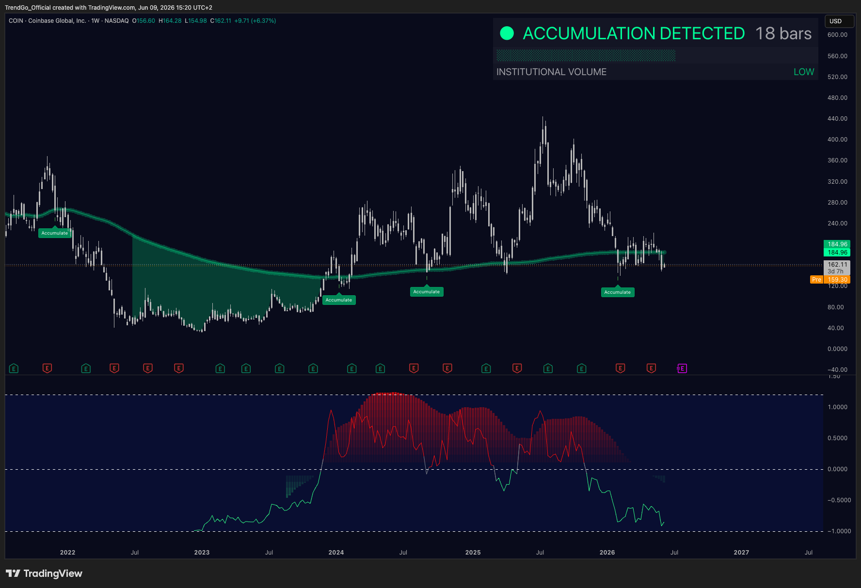
- Double bottom / double top: confirm with Horizon divergence and Pulse behavior change at the second touch.
- Head and shoulders: watch for Horizon momentum to fail to reach overbought on the right shoulder - a sign of weakening.
- Flags and pennants: look for Horizon compression (low momentum) during the consolidation phase, followed by expansion on the breakout.
- Wedges: Pulse red dots appearing during the final leg of a rising wedge = deteriorating behavior confirming the pattern.
Practical
Methods & workflows
8.Lower-timeframe entries
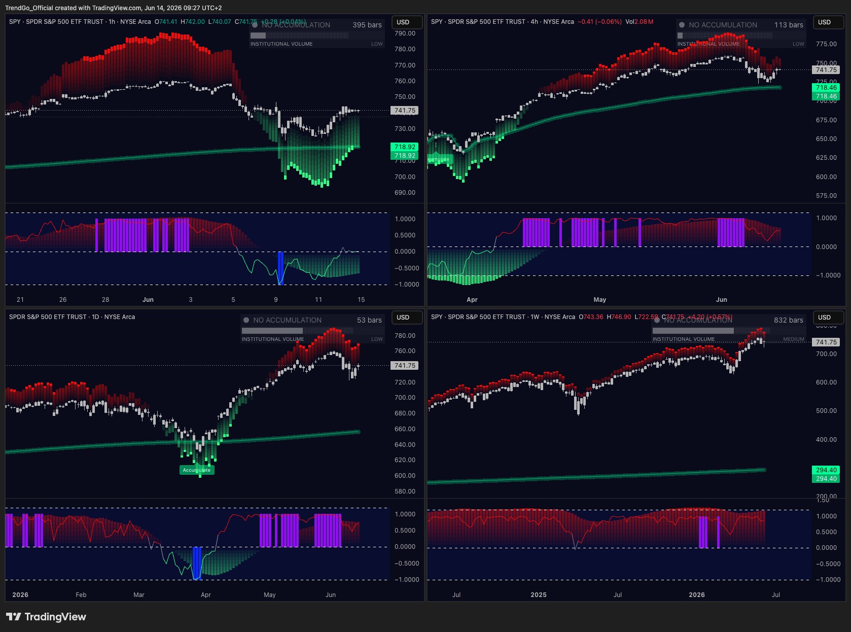
Use higher-timeframe Structura context to identify the directional bias, then drop to a lower timeframe for precise entry timing.
- 1Establish the directional bias on the higher timeframe (4H or Daily) using Accumulate, Horizon, and Pulse.
- 2Drop to a lower timeframe (15min or 1H) to find the entry.
- 3On the lower timeframe, wait for Horizon to reach an extreme and Pulse to confirm the direction.
- 4Enter on the lower timeframe with the stop at the lower-timeframe momentum extreme.
- 5Target the higher-timeframe structure level.
Practical
Methods & workflows
9.Alerts
Setting alerts on key Structura conditions lets you monitor multiple markets without watching charts continuously.
Recommended alert conditions
- Horizon zero-line cross (bullish or bearish) - momentum regime shift.
- Horizon entering overbought or oversold zone - extreme conditions.
- Horizon blue or purple vertical bar - confirmation of extreme zone entry.
- Pulse dot appearance - trend behavior change.
- Price approaching Accumulate curve or zone - structural area.
Alert workflow
- 1Set alerts on the conditions above for your watchlist.
- 2When an alert fires, open the chart and assess the full context (all three layers).
- 3Do not act on the alert alone - use it as a prompt to analyze, not a signal to trade.
Practical
Methods & workflows
10.Stacking confirmations
The more layers of the Structura system that align, the higher the quality of the setup context. This section explains how to read confirmation stacking.
| Confirmations | Quality | What it means |
|---|---|---|
| 1 layer only | Low | Interesting but insufficient - do not act. |
| 2 layers | Medium | Worth watching - wait for the third. |
| 3 layers (1-2-3) | High | Full system alignment - highest-quality context. |
| 3 layers + divergence | Very high | Rare - treat with respect. |
Practical
Methods & workflows
11.Universal tips
Practical principles that apply across all Structura workflows and timeframes.
- Start with the higher timeframe. Always establish the larger structural and momentum context before dropping to a lower timeframe for entry.
- Never use a single layer alone. Accumulate, Horizon, and Pulse are designed to work together. Each layer answers a different question.
- Divergence is a warning, not a signal. Divergence tells you the trend may be weakening - it does not tell you when or where to enter.
- Use Sentinel before opening charts. Know where the interesting conditions are before you start analyzing individual markets.
- Respect the structure. The Accumulate curve and zones are reference points, not precise levels. Price can react around them, not necessarily at them.
- Momentum extremes are not entries. Horizon reaching overbought or oversold is a condition, not a trigger. Wait for the histogram to turn and confirm.
- Patience is the edge. The system is designed to produce fewer, higher-quality signals. Waiting for full confirmation is the discipline.
Methods & workflows
12.Sample playbook
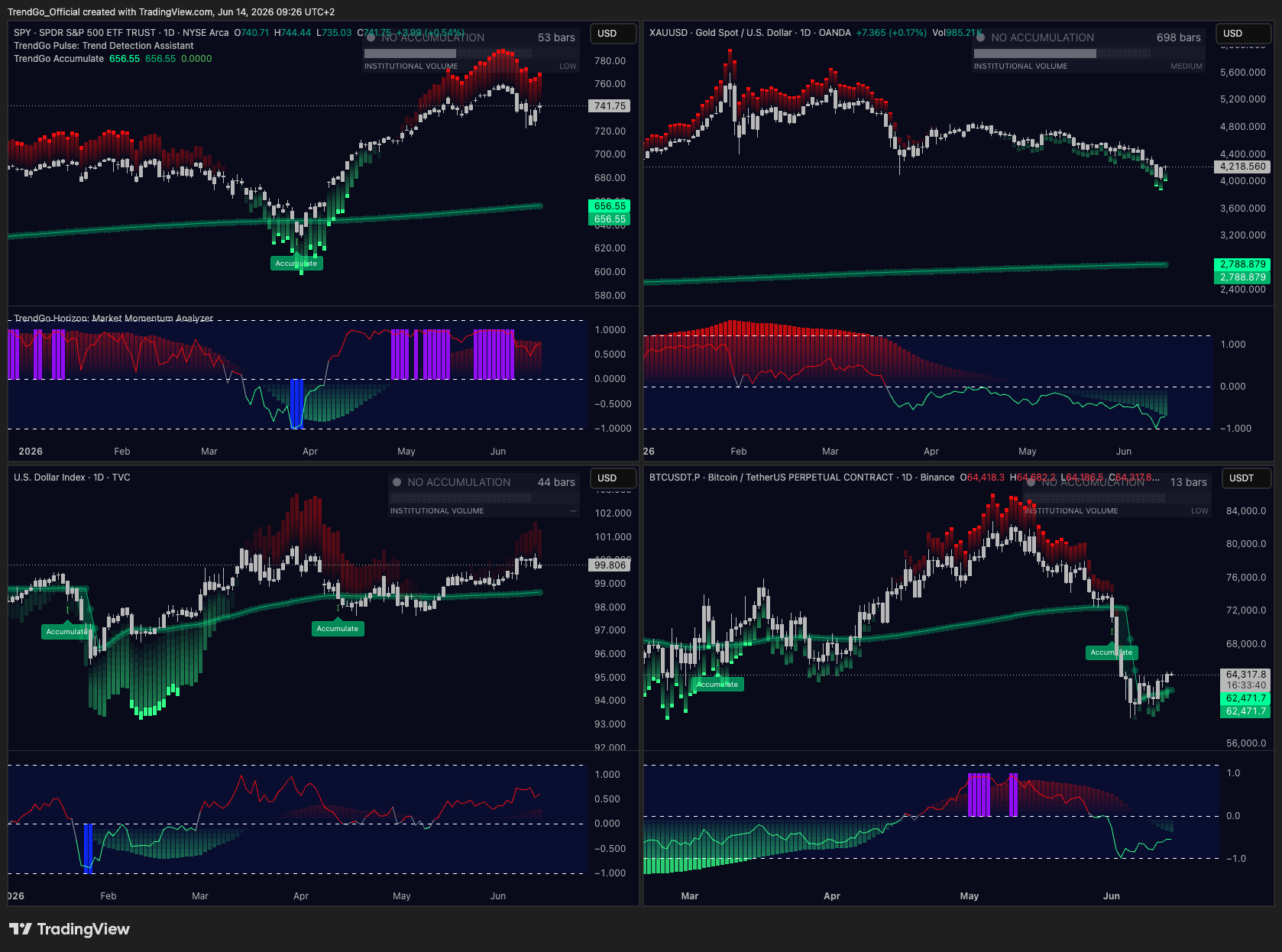
A reference workflow for a complete Structura analysis session, from market scan to trade context.
- 1Open Sentinel. Scan your watchlist for markets showing structural, momentum, or trend behavior conditions. Note the top 3–5 candidates.
- 2Open the first candidate on the higher timeframe (4H or Daily). Check Accumulate: is price near the curve or in a zone? Check Horizon: is momentum compressed, recovering, or extended? Check Pulse: what is the trend behavior showing?
- 3Assess the stack. How many layers are aligned? If fewer than 2, move to the next candidate.
- 4If 2+ layers align, drop to the lower timeframe (1H or 15min). Look for the same conditions on the lower timeframe. Wait for Horizon to reach an extreme and Pulse to confirm.
- 5Define the trade context. Entry: first Pulse green dot after Horizon recovery. Stop: below the lower-timeframe momentum extreme. Target: higher-timeframe structural level.
- 6Set alerts for the conditions you're waiting for. Do not watch the chart - let the alerts bring you back when conditions are met.
Practical
Frequently asked questions
13.FAQ
Common questions about the Structura system, tools, and workflow.
Is Structura available on TradingView and TrendSpider?
Yes. The full Structura workflow (Accumulate, Horizon, Pulse, Sentinel) is available on TradingView. TrendSpider is also supported - note that TrendSpider requires a separate subscription purchased directly from TrendSpider.
Do I need all four tools to use the system?
Accumulate, Horizon, and Pulse form the core three-layer workflow. Sentinel is the scanning layer that helps you find where to apply the core workflow. You can start with just the core three tools and add Sentinel when you're ready to scan multiple markets.
What timeframes work best?
The system works on all timeframes, but the signals have more structural significance on higher timeframes (1H, 4H, Daily). For lower timeframes, use the higher timeframe to establish directional bias and the lower timeframe for entry timing.
How do I know when a signal is valid?
A signal is highest quality when all three layers align: Accumulate shows structural context, Horizon confirms momentum conditions, and Pulse confirms trend behavior. A single layer alone is not sufficient.
What is the difference between Horizon and Pulse?
Horizon reads momentum - the energy behind price movement. Pulse reads trend behavior - whether price is acting constructively or deteriorating. They answer different questions and are designed to be used together.
Can I use Structura for any market?
Yes. The system is designed to work across equities, crypto, forex, commodities, and indices. The framework reads market structure, momentum, and trend behavior - these are universal market dynamics.
Does Structura give buy/sell signals?
No. Structura provides context - structural, momentum, and trend behavior conditions. The system is designed to improve the quality of your analysis and decision-making, not to replace it with mechanical signals.
Where can I get support?
Visit the Support page for documentation, FAQs, and contact information. Members also have access to the community and weekly market structure notes.
Structure is not a prediction. It is a process.
The goal of the Structura system is not to tell you what the market will do. It is to give you a disciplined, repeatable process for reading what the market is doing - and making better decisions as a result.