
For four months last year, Apple's trend layer sat red above price - and price kept climbing. If you read those marks as a sell signal, you stepped off one of the cleanest runs on the chart. If you read them as what they are, you knew exactly where you stood. This is the sixth episode in our one-layer-at-a-time series, and the layer is Pulse: the trend layer, built to read behaviour early - which means it looks wrong before it looks right.
Three questions of every layer
Every episode in the run asks the same three things of one layer: what it reads, what it refuses to say, and what it sounds like right now. Divergence, Accumulate, Blocks, Horizon and Prism have had their turn. This week it is Pulse.
What Pulse reads: five states, one cycle
Most trend tools answer "up or down?" Pulse answers "where in the cycle are we?" It reads how a trend is behaving and marks that behaviour against price, in five states:
Intense green below the bars - a structural bottom is being built. Green below - the bottom is in, the trend is turning up. No marks at all - the trend is developing. The silence is the point. Red above the bars - first signs of the trend losing force. Intense red above - structural top territory.
Green lives under price, red lives over it, and the brighter the mark, the denser the reading. The full method, without this week's dates, is in What a Trend Layer Actually Tells You.
Two full cycles on one chart
Apple's daily chart walks through all five states twice. In April 2025, at the low, Pulse printed intense green under the bars while the chart still looked broken - a bottom being built, marked while it was happening. From May through July the green stayed below price but lighter: the bottom was in and the trend was turning.
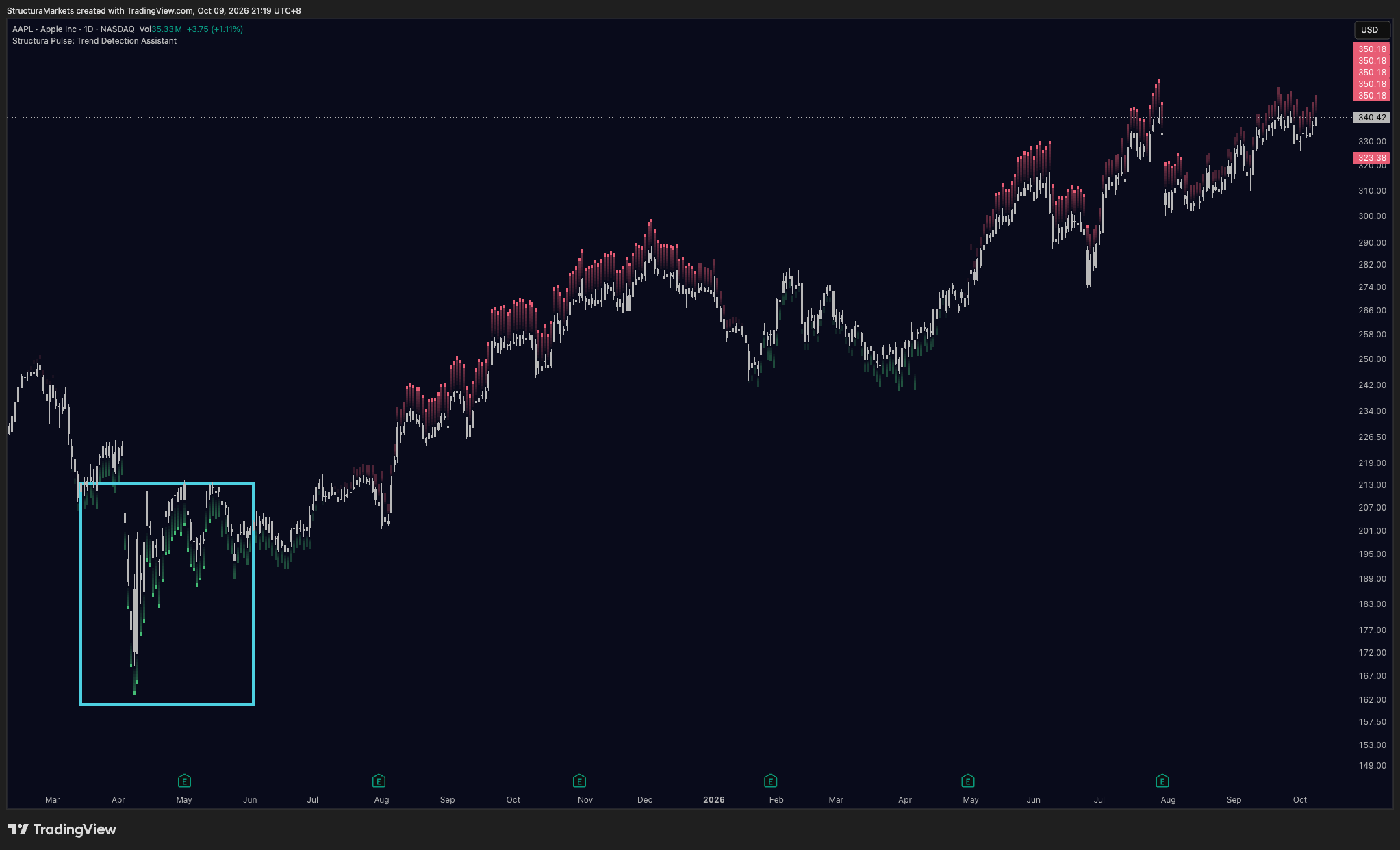
In August the marks flipped above price and stayed there. December brought the brightest red on the chart, right at the high - structural top territory - and into the spring price gave back almost a fifth.
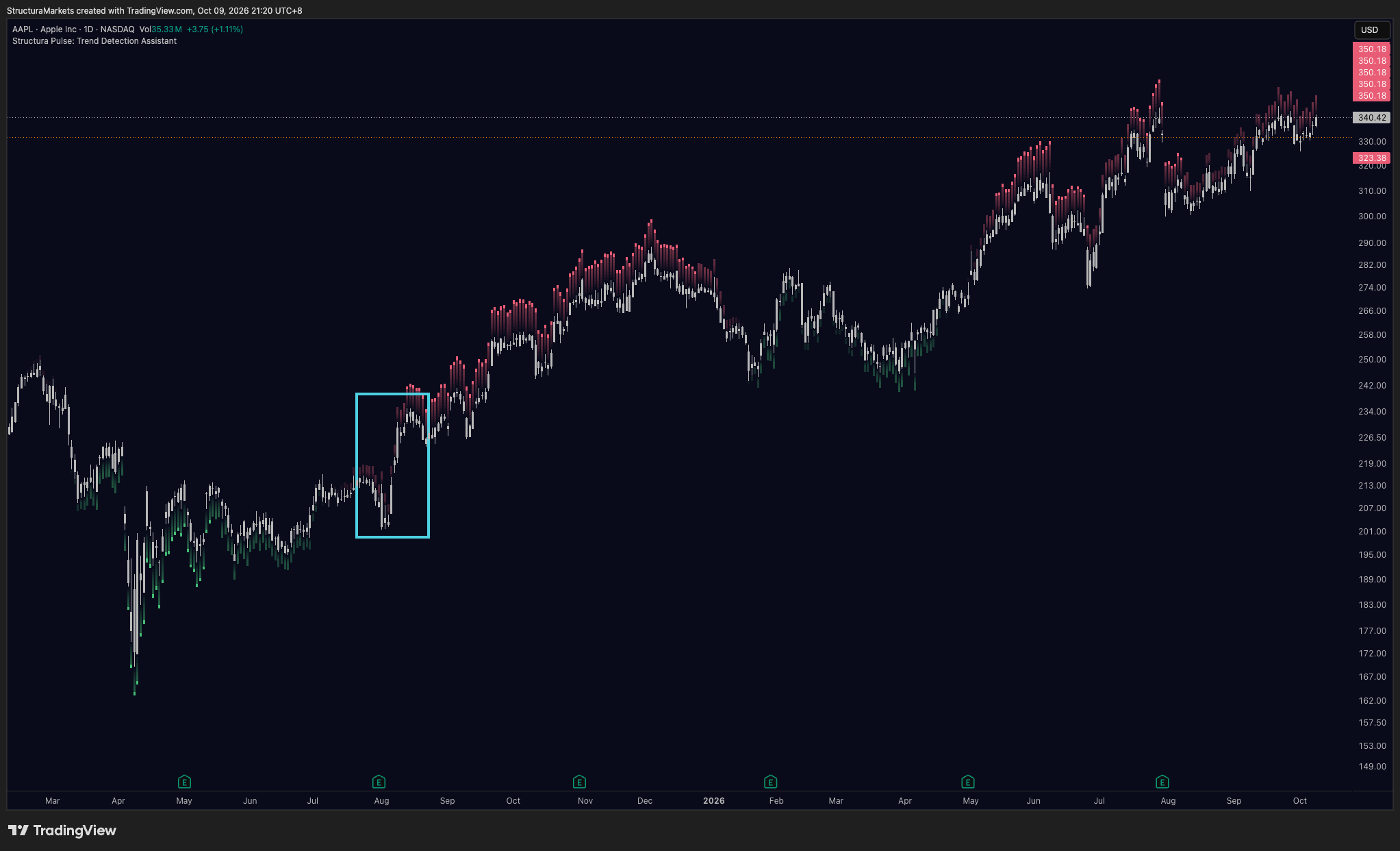
From February to April this year, green appeared below price again: a second bottom being built. Then, in late April and May, nothing. No marks at all while price climbed off the lows. That silence was the trend developing. June brought red above price, July brought intense red at the high, and August opened with a gap down.
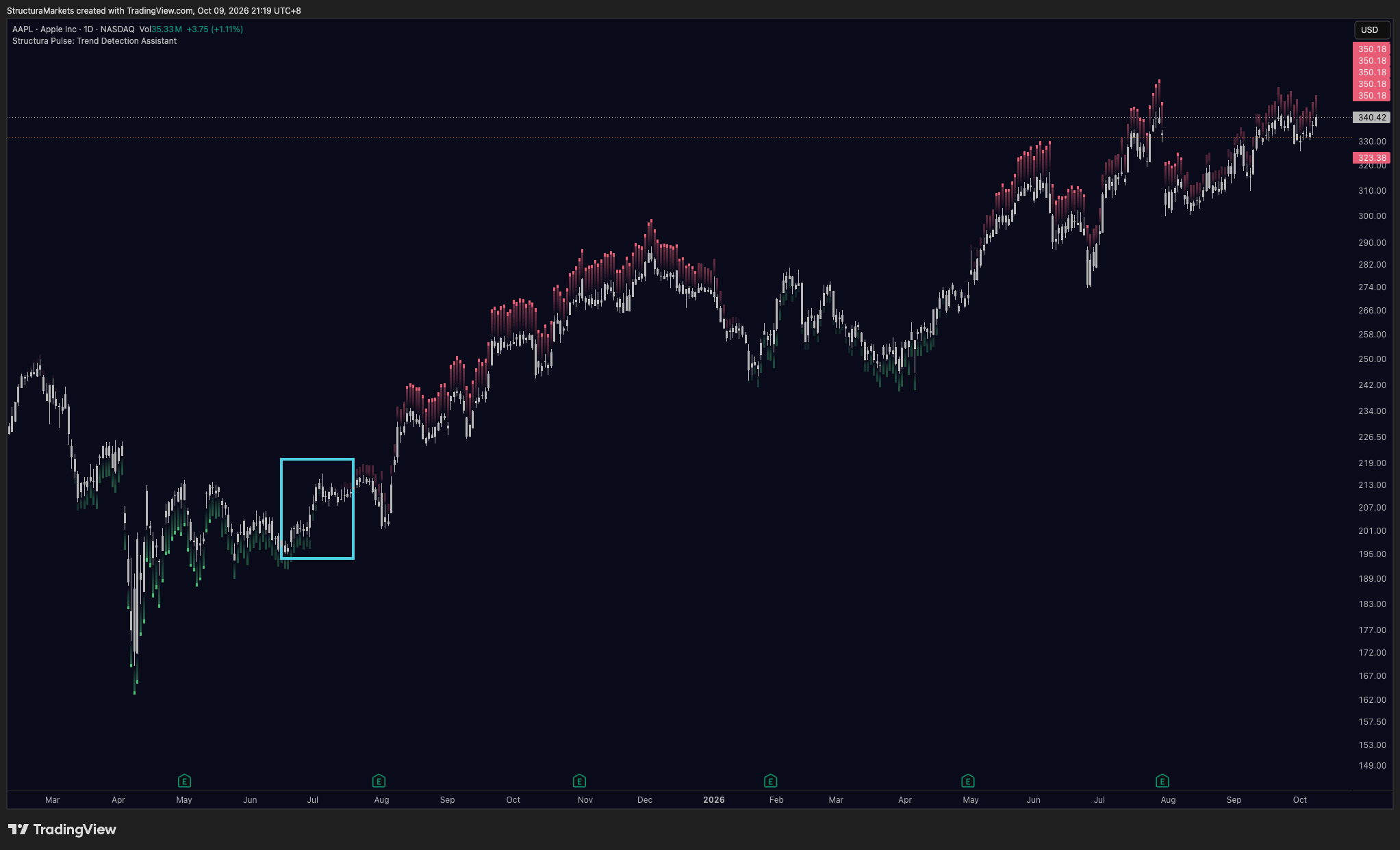
Bottom, turn, silence, weakening, top - twice. One honest note: we picked this chart because it shows all five states cleanly. Not every chart reads this cleanly, and any layer should be checked on your own markets before you trust it.
The honesty tax: four months of red
This is the part most trend tools will not show you. Go back to August 2025: red above price, the first signs of the trend losing force - and price climbed. September, red. October, red. November, red. Four months of a layer saying the trend was weakening while the trend kept going.
Was it wrong? Look at what it was actually saying. Not that price would fall - that the push behind the move was getting harder to sustain. When the high came in December, the layer had been describing that condition for four months.
That is the cost of reading behaviour early: you look wrong, for a long time. A layer that only turned red once the top was obvious would tell you nothing you could not see for yourself.
So here is what Pulse refuses to say. A red mark is not a sell. A green mark is not a buy. It does not fire entries, it does not redraw what it marked, and it never tells you how far. It tells you where you stand.
Where Apple stands today
Red above the bars through August and September, and still there this week, with price just under its July high. The marks are dimmer than the red of July: the first state of weakening, not the last. Friday's close was 336.64.
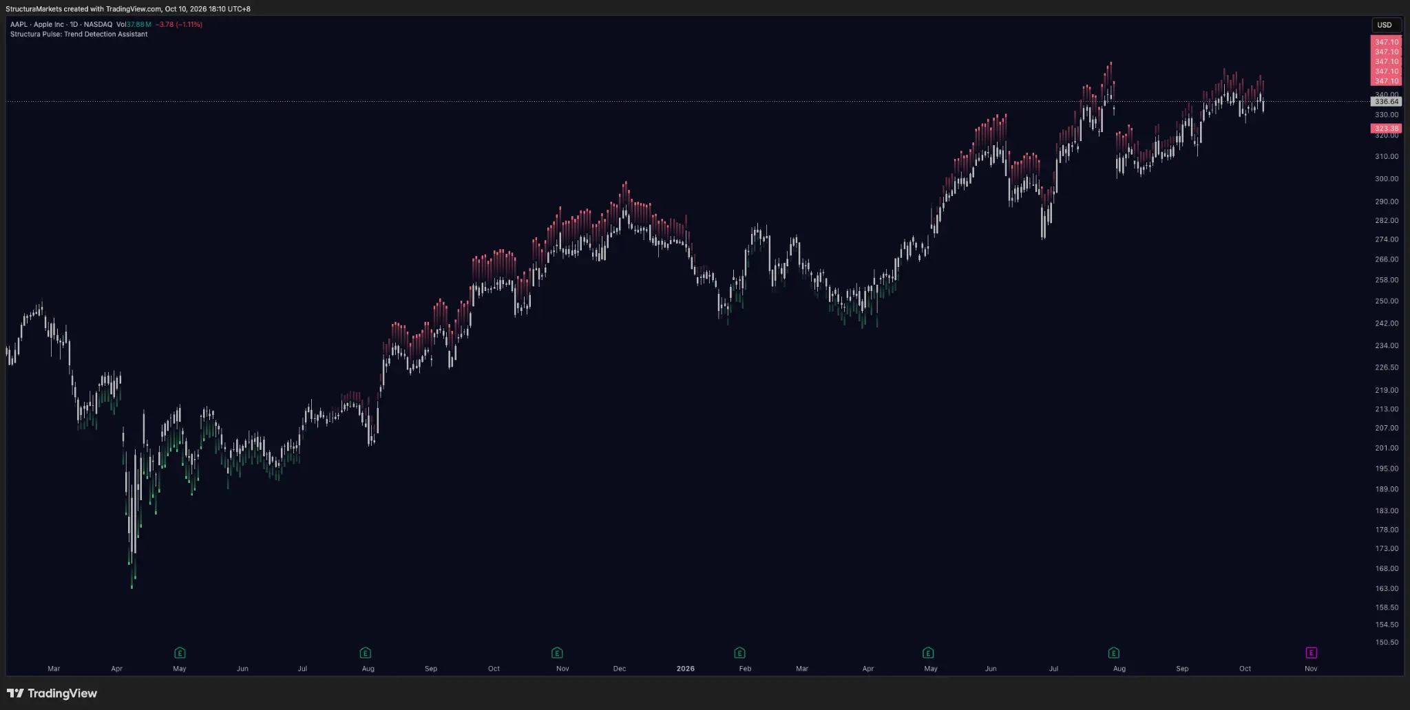
That is not a forecast; it is a condition. The marks clearing while price runs in silence would change it. The red getting brighter at a new high would deepen it. Either way, the layer will show you after the fact. It will not tell you in advance.
Receipts from last Sunday
Gold and silver. A week ago both momentum lines had slipped under zero and Prism found zero alignment between the two. This week the scanner's momentum moved from -38 to -50 on gold and from -44 to -48 on silver. Both dailies still read Distributing, and the structural layer is still silent: 783 bars on gold, 705 on silver.
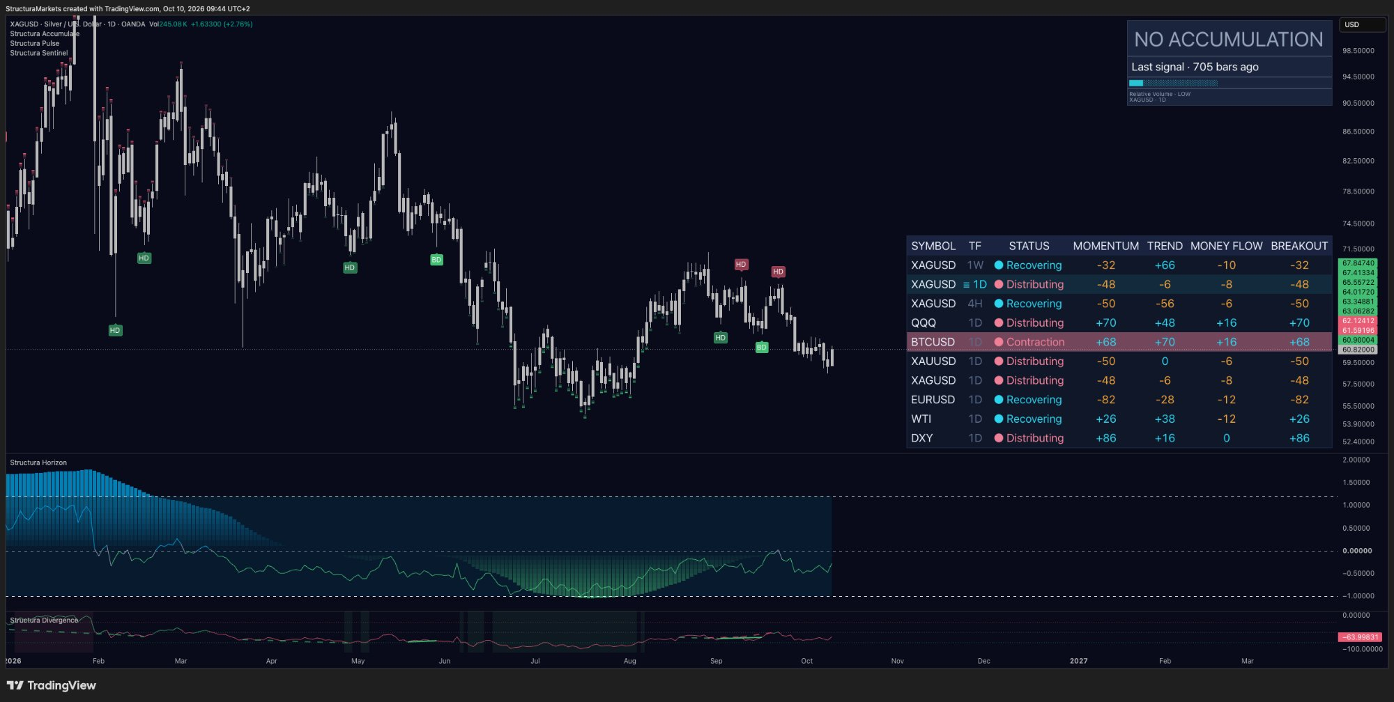
One thing split. Silver's four-hour row now reads Recovering; gold's does not. Same week, same daily status, a different answer one clock down - the first difference between them we can actually point to. And on both metals, Pulse marked the summer lows the same way it marked Apple's: green under price while the bottom was being built.
Nike. Last week we wrote that one structural line has held under Nike's monthly chart since the 1980s, about 20% below price. It is still about 20% below. The scanner's monthly momentum now reads -100, the bottom of its scale, and the monthly candle still has three weeks to run. Nothing has been decided. The distance is the thing to watch.
Where Pulse lives
Pulse is one set of marks on your chart, and it answers the question direction cannot: where in the cycle are we? It lives in Compass, together with Horizon, at $29 a month. Accumulate, Divergence and Blocks stay free for everyone.
Educational market commentary - not financial advice. Structura does not issue signals or predictions.
Read us first in your Google results:
Free on TradingView
Get the free structure layer.
Structura Accumulate marks where the market may be rebuilding structure before the move becomes obvious.
Get the free structure layer