
Wyckoff accumulation is the name given to a particular kind of price range: one that forms after a decline, absorbs supply without breaking lower, and eventually resolves upward. The five phases have been taught for nearly a century. They are useful — as a map. The mistake is treating the map as a prediction, or assuming a real range needs to look like the diagram before it counts.
This article explains the five phases, the events inside them, what a real accumulation range looks like, and what the model cannot tell you.
The textbook version: five phases
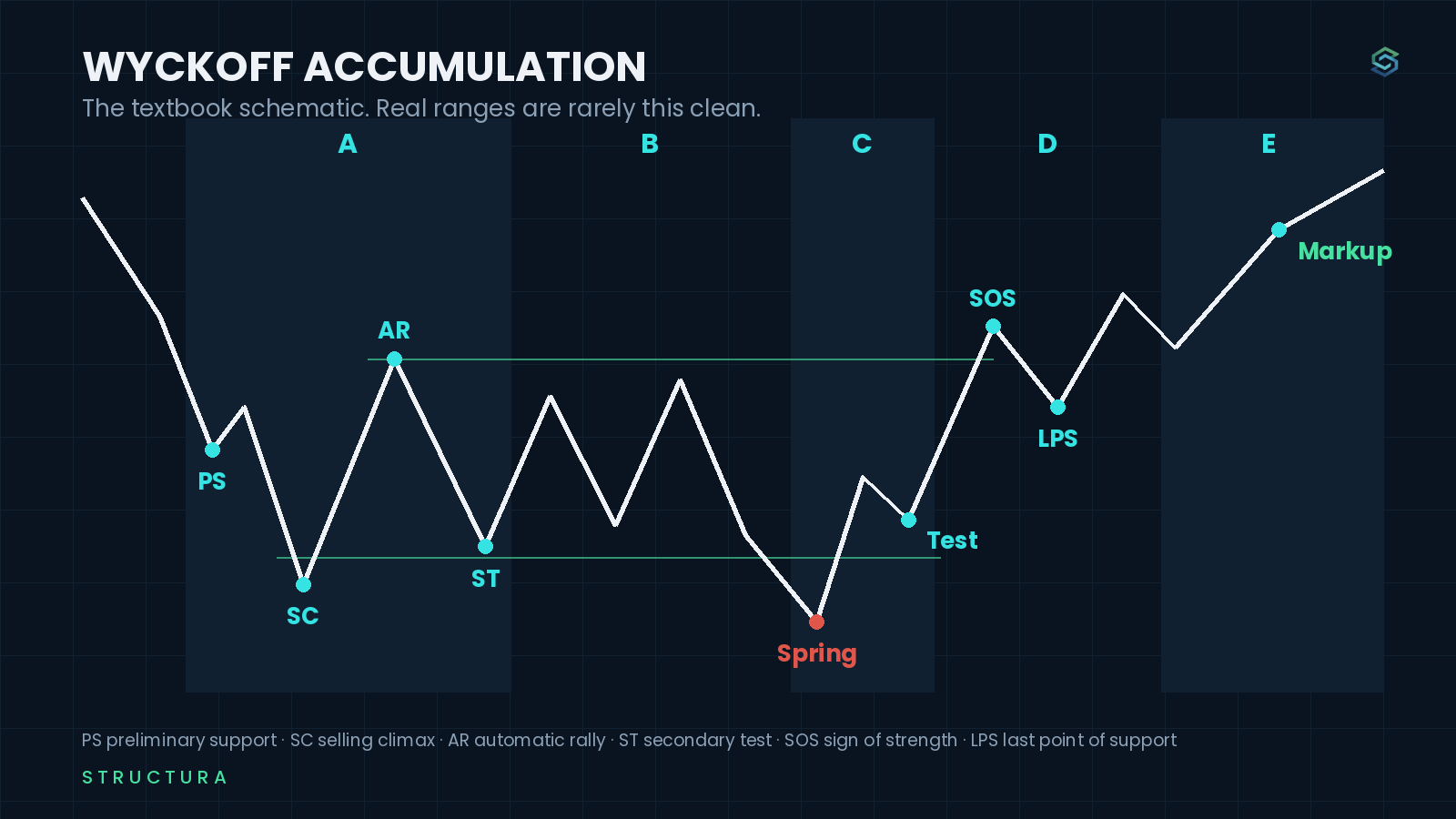
Richard Wyckoff described accumulation as a process that unfolds in five phases. The labels are a language for what price and volume are doing inside a range — not a checklist that every chart must complete.
Phase A — the decline stops. Selling pressure reaches an exhaustion point. The selling climax (SC) is often a wide-range bar on high volume. It is followed by an automatic rally (AR): price bounces because the selling that was pushing it down has temporarily run out. The range between the SC low and AR high becomes the first outline of the trading range.
Phase B — the range gets built. Price moves back and forth between the early boundaries. This is the longest phase and the least dramatic. Supply is being absorbed gradually. The market is testing whether selling still appears at the lows, and whether buying still follows through at the highs. Most of the range is Phase B.
Phase C — the test. Price makes one more move toward or through the lower boundary. In the textbook version this is the spring: a brief break below the range that fails and reverses. It tests whether supply is still waiting below. A spring is not required. Some ranges never make one. The question is not whether the chart has a dramatic false break — it is whether the final test of the lows finds less selling than before.
Phase D — demand takes control. Price starts making higher lows. It pushes toward the upper boundary with more ease. The sign of strength (SOS) is the first convincing move through resistance. The last point of support (LPS) is the pullback that follows: price comes back, finds support above the old range, and holds.
Phase E — the range is left behind. Price moves into markup. The old resistance becomes support. The accumulation range is now a historical object — a place where the market spent time transferring ownership before the advance.
What the diagram leaves out
The diagram is clean because it is a teaching tool. Real ranges are not.
Some have no obvious spring. Some have two or three. Some break upward, come back into the range, and only then resolve. Some look like accumulation for months and fail lower. The labels only become clear after the fact, which is why using them as entry instructions is backwards.
The useful part of the model is not the exact sequence. It is the questions it gives you:
Has selling stopped making progress?
Is the range holding together, or are the lows still being pressured?
When price tests the low, does it find less selling than before?
When price pushes higher, does it hold the ground it gained?
Those questions work whether the chart looks like the schematic or not.
A real Wyckoff accumulation example: Berkshire Hathaway 2022
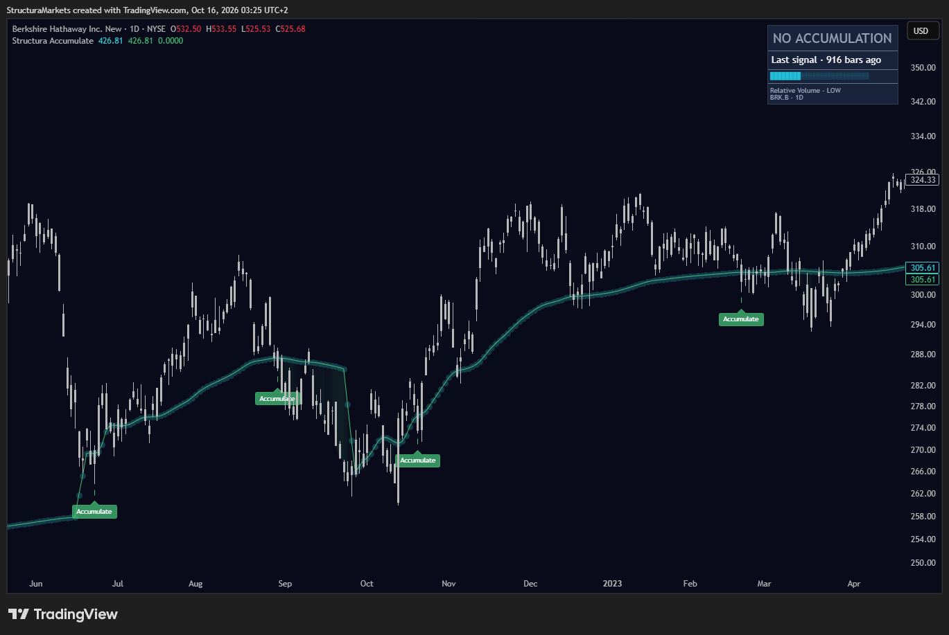
Berkshire Hathaway's daily chart in 2022 is a useful example because it is not clean. The stock declined into June, built a range through the summer, broke down again in October, recovered, and then spent the next six months working higher before the move became obvious.
The range did not have one textbook spring. It had several tests of the lows. The automatic rally in August set an early ceiling. September and October pushed back toward the June low and held. The November low was lower still — but the recovery from it was faster, and the range did not break apart.
What matters is not whether we can label every bar. It is that the character changed: the declines stopped extending, the recoveries got more durable, and by early 2023 price was spending more time above the middle of the range than below it.
The accumulation was only obvious later. In real time, it was a range that had not failed yet.
The five events to watch
The phase labels are useful, but the events are more useful. You can look for these on any range without needing to decide which phase you are in.
The selling climax. A sharp decline that ends with unusually wide bars, high volume, and a quick reversal. It shows that sellers who have been pressing the market may have run out of urgency. It does not prove a bottom.
The automatic rally. The first meaningful bounce after the selling stops. It shows what price can do when the pressure is removed. The high of that rally often becomes the first resistance to watch.
The secondary test. Price returns toward the low. The question is whether it does so with the same force. A test that holds above the low, or breaks it briefly and recovers, tells you more than the first bounce did.
The sign of strength. Price moves through the upper part of the range with follow-through. Not a single green bar — sustained progress that does not immediately reverse.
The last point of support. The pullback after strength. This is often the cleanest part of the whole process: price returns to the area it just cleared and finds support there. The range has changed its role.
The difference between accumulation and a range
Every accumulation is a range. Not every range is accumulation - a distinction that starts with what an accumulation zone is.
A sideways market can be a pause in a downtrend. It can be distribution before a decline. It can be a market with no particular imbalance of supply and demand. The range itself does not tell you which one it is.
What separates accumulation is the behaviour inside it. Lows stop extending. Downward pushes get absorbed. Tests of the low lose force. Recoveries begin to hold. Price spends more time in the upper half of the range. None of these alone is enough. Together, over time, they describe a market where selling is being processed rather than simply delayed.
That is why time matters. A two-day pause after a decline is not an accumulation range. A six-month range that survives several tests and slowly shifts upward is a different object.
What Accumulate marks — and what it does not
Structura Accumulate is built around the same observation: a range where price spends time being absorbed, with an adaptive reference that shows where the structure sits relative to current price.
It does not label Phase A through E. It does not draw springs or predict markups. It marks the zone and lets you see how price behaves around it.
The difference matters. A tool that labels a spring is telling you it knows what the chart means. A tool that marks a zone is giving you the place where the question is being asked.
On the Berkshire chart, Accumulate printed zones near the June low, the October low, and again during the recovery. Each one marked a place where the range was being tested. None of them said the low was in. The zone that held became more meaningful. The one that failed became part of the record.
How to read a zone without the labels
You do not need to know Wyckoff terminology to read an accumulation range. Three things are enough.
Where is price relative to the zone? Above it, inside it, or below it. A zone that price has left and held above is different from one price is still testing from below.
How long has the zone been there? A range that has survived six months has absorbed more than one that has survived six days. Time does not make it more likely to resolve upward. It tells you how much of the market's attention has been spent there.
What happens on the next test? This is the one that matters. Price returns to the zone. Does it hold? Does it slice through? Does it bounce but fail to make progress? The answer is not in the label. It is in the next interaction.
A zone is a protocol, not a conclusion. You mark it before you know the answer, so you can recognise the answer when it comes.
What does a failed Wyckoff accumulation look like?
An accumulation range can fail. Price breaks below the low, the zone does not hold, and the market keeps moving lower. This is not the model being wrong — it is the model giving you a clear place to be wrong.
The failure is useful precisely because the range was defined. You knew where the test was. You knew what a rejection would look like. The alternative — deciding a market is accumulating because it feels cheap — has no such boundary.
This is the discipline Wyckoff's model is supposed to teach, and the part that gets lost when it is turned into a pattern. The range gives you a location. The market gives you the result.
Common questions
Is Wyckoff accumulation the same as a support zone?
Not exactly. A support zone is a place where price has found buying before. Wyckoff accumulation is a process that can create support: a range where supply is absorbed over time. The zone that comes out of it may act as support later, but the accumulation is the history inside the range, not the line you draw after it.
Does every accumulation range lead to a markup?
No. Some ranges fail lower. Others resolve sideways and lose relevance. The model describes conditions inside the range, not the outcome. A markup is what happens after the range has proved itself — it is not something the range promises.
What is a spring in Wyckoff accumulation?
A spring is a brief break below the lower boundary of a range that quickly reverses. In the classical model it tests whether selling remains below the range. But not every accumulation has one, and a false break is not proof of accumulation by itself. The question is what happens after the break: does price recover and hold, or does it continue lower?
Can I use Wyckoff accumulation on any timeframe?
Yes, but the meaning changes with the timeframe. A daily range can be accumulation inside a weekly decline. A four-hour range can be noise inside a daily accumulation. Read the slower timeframe first, then use the faster one to see how the range is developing. The labels do not travel cleanly between clocks.
What should I do when an accumulation zone fails?
Treat the failure as information, not a reason to force a new conclusion. The zone did not hold. That is the answer to the question it was asking. You can mark the failure, step back, and decide whether the conditions for the original read still exist. The value of a defined zone is that it tells you where the read changed — not what to do next.
Educational market commentary — not financial advice.
Read us first in your Google results:
Free on TradingView
Get the free structure layer.
Structura Accumulate marks where the market may be rebuilding structure before the move becomes obvious.