
A rebound arrives in one bar. A base takes weeks. That is the short answer to a question one of our members, Davide, sent us this week, and the long answer is worth walking through on a single chart. He asked how Accumulate, Horizon and Pulse work together, especially when they disagree; how to tell real accumulation from a temporary rebound; how to judge the strength of a trend; and what turns a setup into something actionable, on the daily, the four-hour and the hourly. Lockheed Martin happens to show all of it.
Three layers, three jobs
Each layer answers one question, and only one. Accumulate answers where: where structural absorption has taken place, and for how long. It is the slow clock. Pulse answers when, in the cycle: a bottom being built, the turn, the silence of a trend developing, the first signs of weakening, top territory. Horizon answers how hard: momentum, moving in waves that build, peak and fade.
When all three point the same way, that is alignment. When they don't, that is information - it tells you which part of the move has not been confirmed yet.
What a base looks like
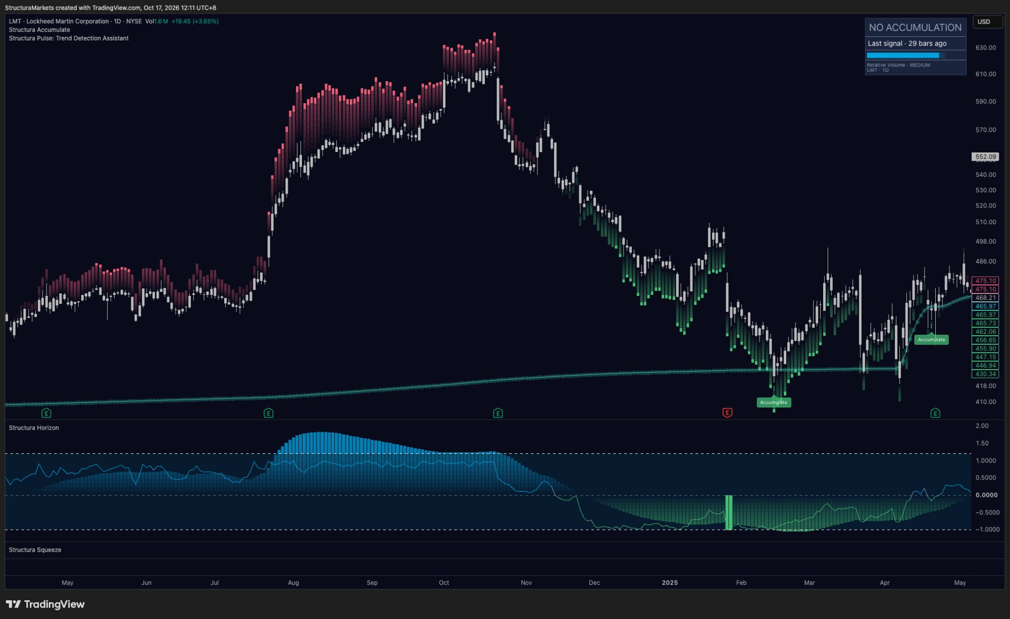
Lockheed's 2025 low shows the three signatures of a base. In February 2025, after a long slide, price dropped below the reference and the Accumulate stamp printed. The zone opened. All the way down, Pulse had green under the bars - a bottom marked while it was being built.
Then Horizon. From the low, the momentum histogram climbed bar after bar for three months, and in mid-April the line crossed zero and stayed there. And then the detail most people miss: the reference itself turned up. A new line started rising under price; in late April price dipped below it, printed one more stamp, and held.
Time in the zone. Momentum rebuilt as a wave. A reference that starts to rise. Any one of them can appear on its own. Together, they describe a base.
What a rebound looks like
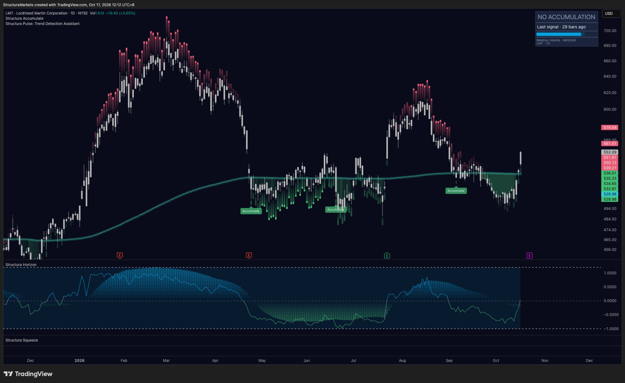
This summer, the same chart showed the opposite. After three months under a flat reference and two stamps, one session in July - on earnings - lifted price clean above the line. It looked like the turn.
The layers read it differently. The reference didn't move: flat before, flat after. Horizon didn't build a wave; its line jumped across zero in a single bar, and the histogram never came close to its highs from earlier in the year. And within a week, Pulse was red above price - the first signs of the trend losing force - with top territory by mid-August. By September price was back on the line, another stamp printed, and the zone kept building.
| Base (2025) | Rebound (2026) | |
|---|---|---|
| Reference | starts to rise | stays flat |
| Horizon | builds a wave | jumps in one bar |
| Pulse | green, then silence | red within a week |
| Time | weeks | one session |
Judging the strength of a trend
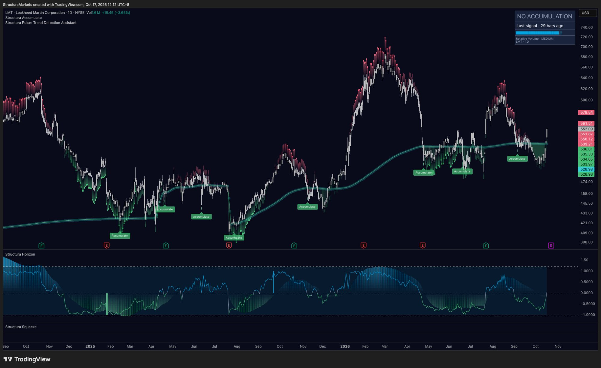
Strength is not one big candle. In November 2025 a stamp printed, price shook out below the line into December, and then climbed back above it. From there everything lined up: the reference curled upward under price, Horizon pushed above zero with the histogram expanding into March, and through the first weeks of January Pulse went quiet. No marks at all. That silence is the trend developing.
A rising reference, an expanding momentum wave, and a trend layer with nothing to say - that is what strength looks like on these layers. And when a trend starts to age, Pulse tends to say so first: red appeared above price in late January while price was still climbing hard. The high came about six weeks later, in early March.
Four clocks, today
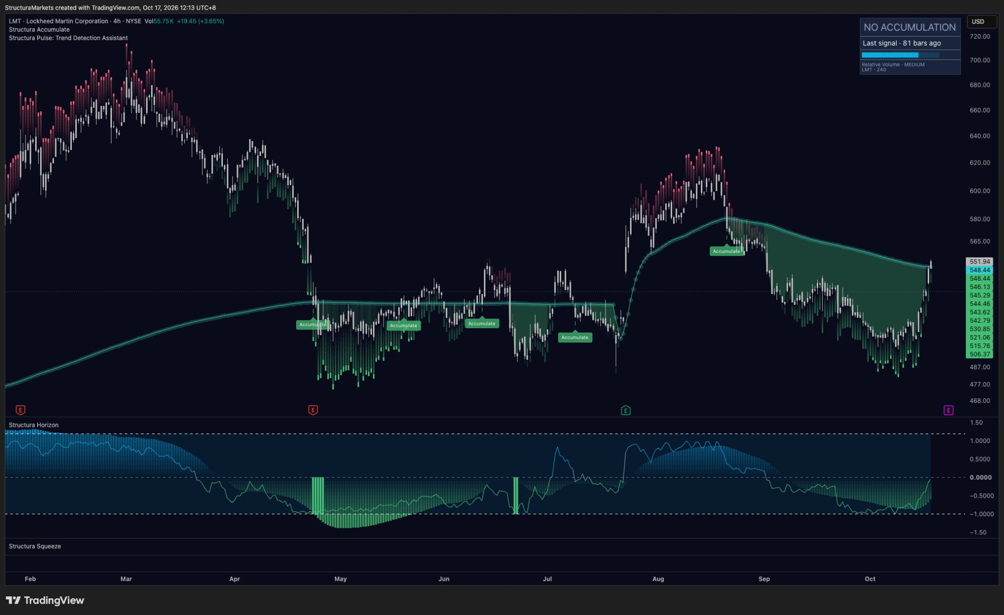
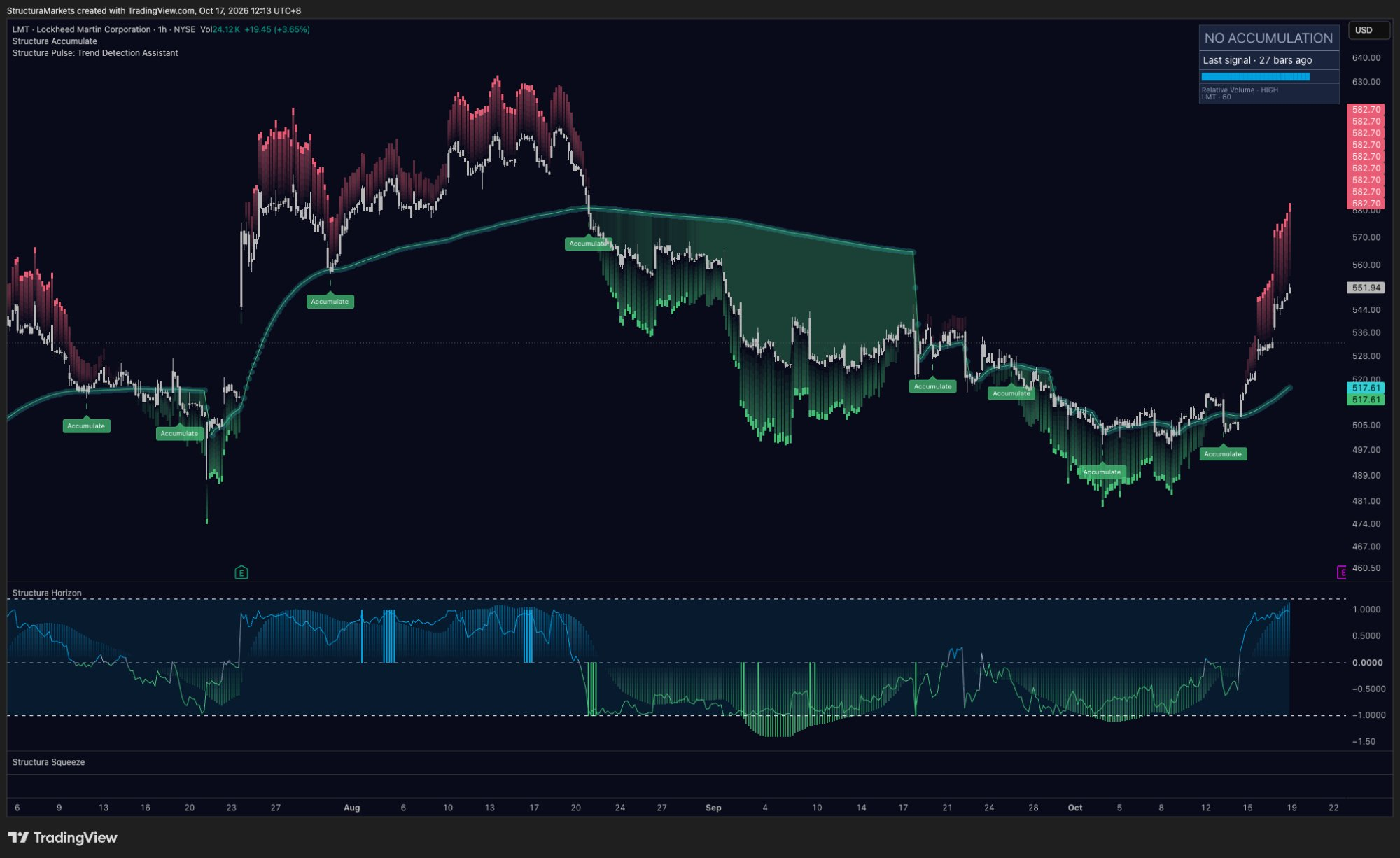
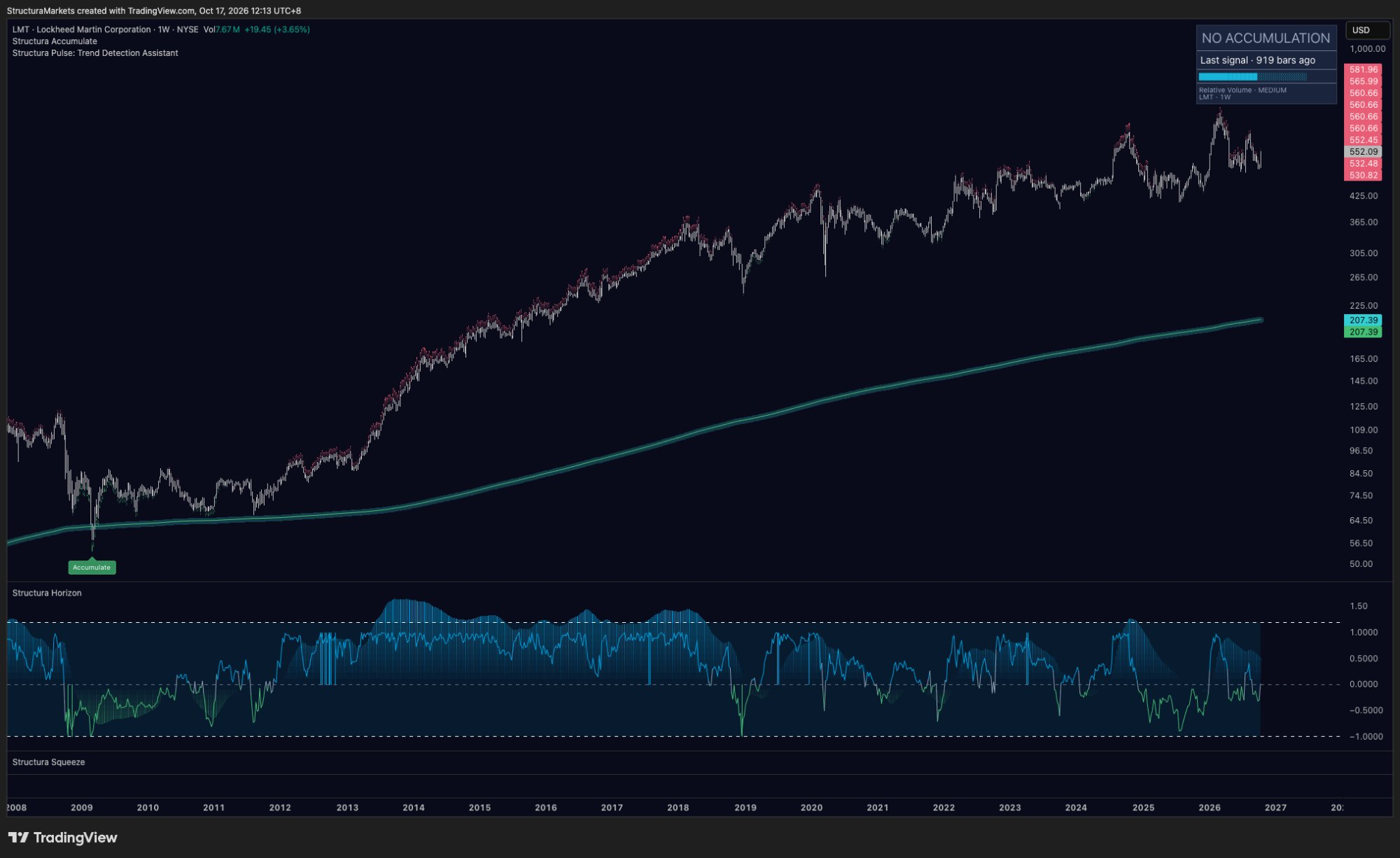
At Friday's close, Lockheed gives four different answers on four timeframes.
Hourly: from the October low price ran almost in a straight line. Pulse is already red above the bars and Horizon is pressed against the top of its range. On this clock the move is mature.
Four-hour: price has just reclaimed its reference for the first time since the stamp in late August. Pulse is still green underneath, and Horizon is climbing back to zero from the floor. On this clock the turn is brand new.
Daily: Friday's close was 552.09, back above a flat reference just under 530. Pulse is green under the October low; Horizon's line is right at zero with the histogram flat. On this clock nothing is decided yet.
Weekly: no Accumulate signal since 2009. The long-term structure has not been touched, and the momentum wave from this year's rally is fading slowly.
The fast clocks always turn first. The slow clocks decide whether it lasts.
From setup to alignment
We don't hand out entries - that part is yours. What the layers can give you is a clear picture of what alignment would look like from here. On the daily: closes that hold above the reference; the reference itself starting to curl up, the way it did in April 2025 and again in January; Horizon building a wave above zero rather than spiking through it; and Pulse going quiet instead of turning red within a week, the way it did in July. If that shows up, the fast clocks simply got there first.
If the opposite shows up - red above on the daily, Horizon rolling back under zero, closes back under the line - then this was another rebound, and the zone simply keeps building. Either way, it is information rather than a verdict. One date to know: Lockheed reports on Thursday, October 22. An event can move price a long way in one bar; the layers judge what happens after.
A note on the examples: we chose Lockheed because one chart shows a base, a rebound and a strong trend side by side. Not every chart reads this cleanly - check any layer on your own markets.
Where the layers live
Accumulate is free on TradingView for everyone. Horizon and Pulse live in Compass, at $29 a month. And if you'd rather not read four clocks by hand, Prism reads every layer for you.
Thank you, Davide. Send us your questions - the good ones become episodes.
Educational market commentary - not financial advice. Structura does not issue signals or predictions.
Read us first in your Google results:
Free on TradingView
Get the free structure layer.
Structura Accumulate marks where the market may be rebuilding structure before the move becomes obvious.
Get the free structure layer