
Sunday Read #9 · One layer at a time · 04 Horizon
This is the S&P 500 on the daily, from January last year to today. Price tells one story: up. Two sharp drops, and every time, higher.
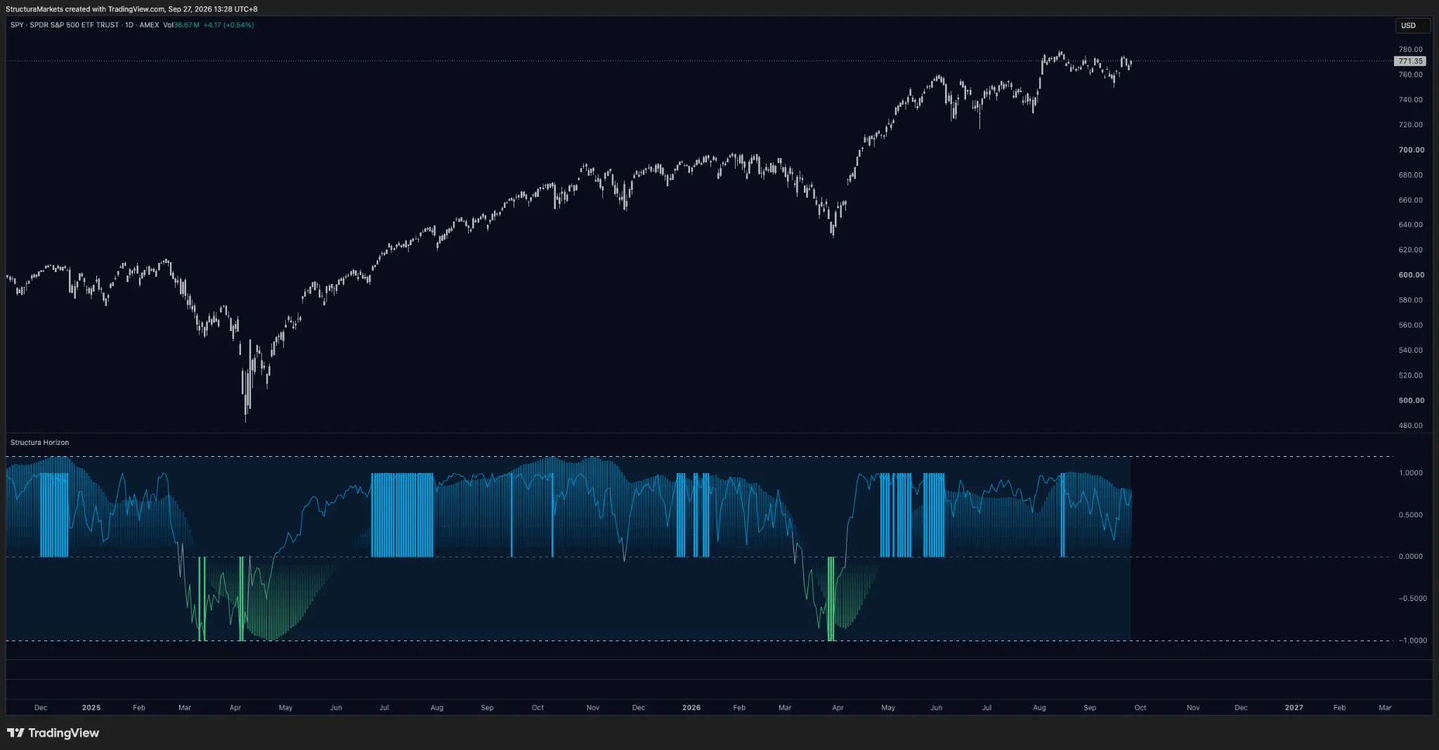
The line underneath tells a different one. That is Horizon, our momentum layer, and it shows how price got here: not in a straight line, but in waves. Twice in twenty months, momentum ran to the top of its range, rolled over, fell through zero, hit the floor and came back. Same shape, twice. The price chart shows where the market went. This line shows the engine.
Fourth in the run, first paid layer
one layer at a time, three questions of every tool: what does it read, what does it refuse to say, and what does it sound like right now. Divergence, Accumulate and Blocks came first. Horizon is the first paid layer in the series.
What it reads
Horizon measures one thing: how hard the market is pushing, and in which direction. Not where price is, but how much force is behind it. Two things move in that panel - the line and the histogram behind it - on a scale from minus one to plus one, with zero in the middle. Three conditions are worth knowing by sight.
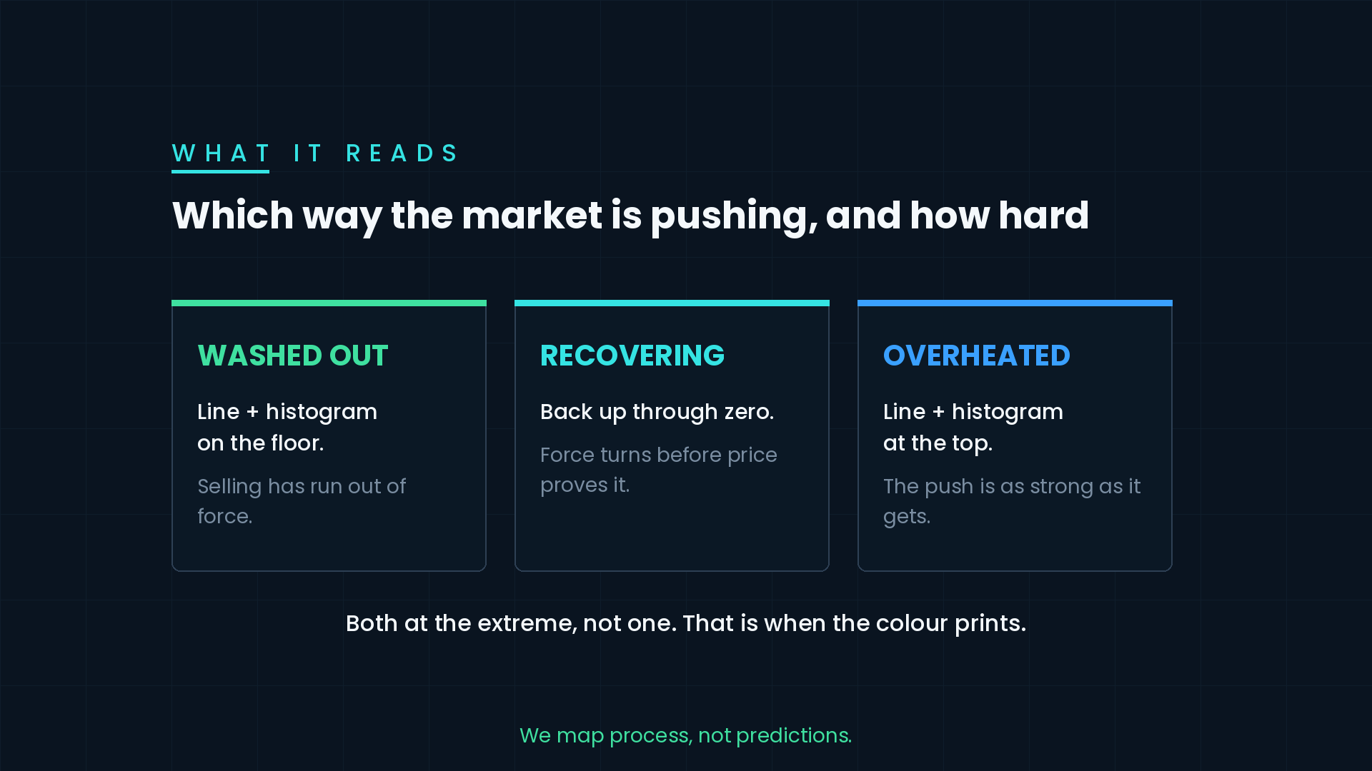
Washed out. The line and the histogram both on the floor at the same time; the bars turn green. Selling has run out of force.
Recovering. The line comes back up through zero. Force has changed direction before price has proven anything.
Overheated. The line and the histogram both pinned at the top; the bars turn blue. The push is as strong as it gets.
Both, not one. A line at the edge with the histogram lagging behind is not the condition, which is why the colour prints rarely - and why it means something when it does.
Think of it as a compass. It does not tell you the destination. It tells you which way the market is pointing and how hard it is pulling - and it reads the same way on an index, a single stock, gold or a currency.
Two waves on one chart
Walk the chart from the left.
In January last year momentum was running hot. In February the line rolled over, crossed zero in March and went straight to the floor. Washed out. Price made its low in April.
Then the order of events matters. By May, momentum was back above zero while price was still far below where it had started the year. The line turned before the price did. Through the summer it climbed to the top of its range and stayed there, and price followed for months.
In November it dipped to zero, touched it and held. No washout - a pause, not a turn.
Then the second wave. In February this year the line rolled over again, fell through zero and hit the floor at the end of March. And again, momentum was back above zero in April while price sat well under its old high. By May it was pinned at the top.
Washout, recovery, heat, fade. Twice in twenty months, on the most-watched chart in the world. That is what a momentum cycle looks like when you can see it.
What it refuses to say
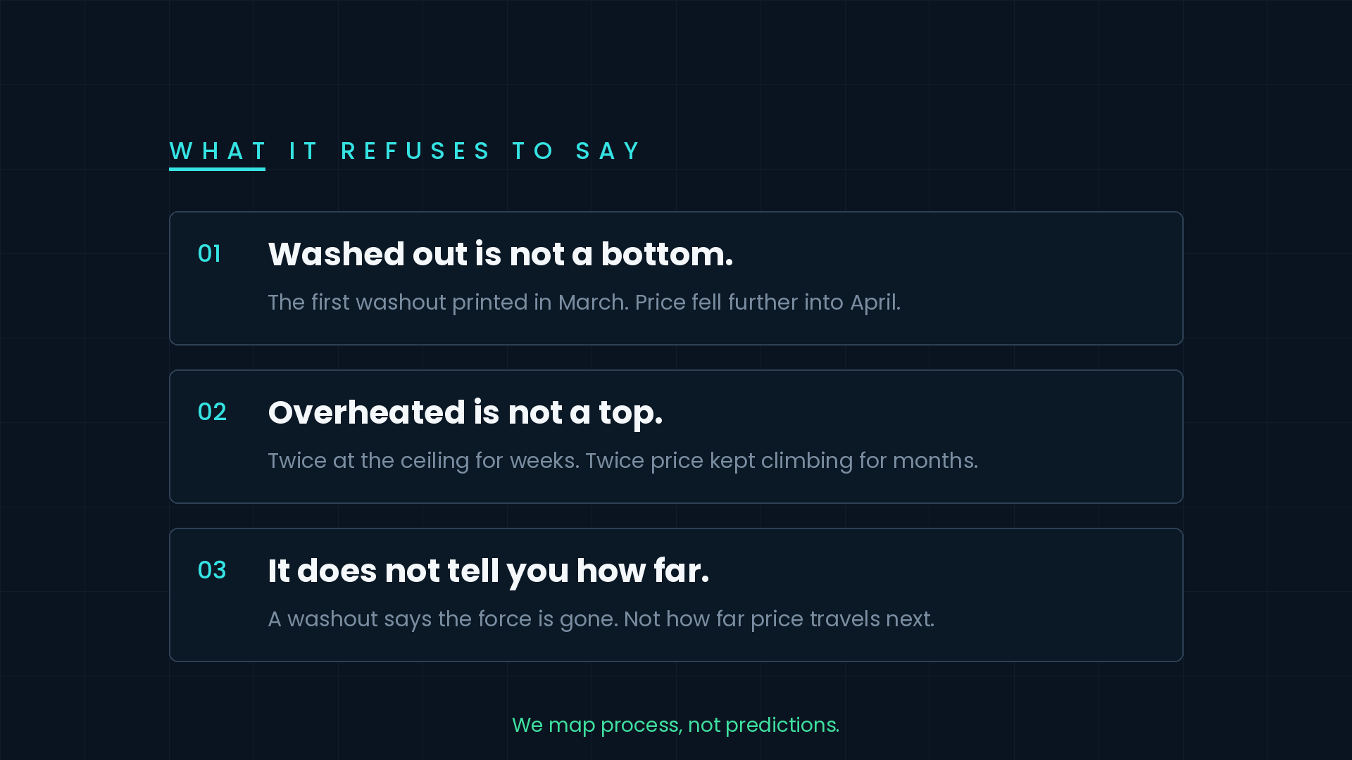
Washed out is not a bottom. The first washout last year printed in March - and price fell further into April. Washed out means the selling has run out of force. It does not mean the selling is over.
Overheated is not a top. Last summer the line sat at the ceiling for weeks. This May, the same. Both times, price kept climbing for months. Treat those blue bars as a signal to sell, and you would have stepped out of the two best runs on this chart. We could have built a sell signal out of them. It would have looked brilliant on a few charts and cost you on this one, so we did not.
It does not tell you how far. A washout says the force is gone. It says nothing about how far price travels once the force comes back.
Where the compass points today
No washout since April. Momentum has stayed above zero for five straight months. The waves since August are shallower - the line has not pinned the ceiling the way it did in May and June - but it has not come near the floor either. This week it is rising again, with SPY at 771.35, just under its high.
That is a condition, not a forecast. What would change it is a slide back through zero. What would not is another stretch at the top: in twenty months on this chart, heat has not once marked the end of a run.
Last week's receipt
Last Sunday we asked which metal is early, gold or silver. A week later, the compass puts them in the same place from opposite directions. Silver's momentum line sits on zero, reached from below after a summer washout. Gold's sits on zero too, reached from above after a run in August that it has given back entirely. Both dailies still read Distributing, and neither has printed an accumulation mark in years - 773 bars on gold, 695 on silver. No answer yet, but a sharper question: which one leaves the line first, and in which direction.
Where Horizon lives
Horizon is one line under your chart, and it answers the question price cannot: how much force is behind the move. It now sits in Compass, our core plan - Horizon and Pulse together, $29 a month. Accumulate, Divergence and Blocks stay free for everyone.
Everything on a chart moves in waves. This is the line that shows you which one you are in.
We map process, not predictions.
Read us first in your Google results:
Free on TradingView
Get the free structure layer.
Structura Accumulate marks where the market may be rebuilding structure before the move becomes obvious.
See Compass →