
Sunday Read #8 · One layer at a time · 03 Blocks
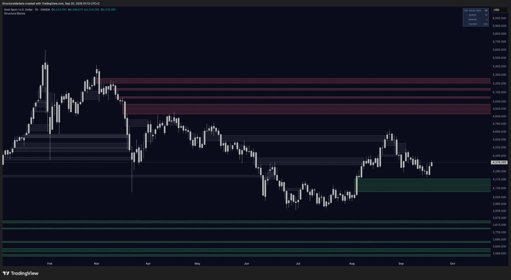
This is gold on the daily, February to today, with our imbalance layer on it.
The four red areas at the top of the chart formed in February and March, on the way down from the high. Each one is a place where price moved too fast for both sides to be there — a gap. And each one stretches all the way to the right edge, because in six months the market has not come back to any of them.
If you learned about fair value gaps the way most people did, that looks like a tool that failed four times. It is not. It is a tool doing the one thing it promised, and this episode is about why that is the part worth having.
Third in the run
One layer at a time, one tool each, three questions of every one: what does it read, what does it refuse to say, and what does its silence sound like. Divergence, then Accumulate — and now Blocks, the newest free layer, the one our founding members voted for, and the one built on a concept we did not invent.
What it reads
Price moves because one side runs out. In an orderly market, buyers and sellers meet across a range and every level gets tested. Sometimes that does not happen: a large participant needs to move size, a number comes out, a position is liquidated, and price relocates instead of negotiating. It skips a band of levels on the way. That skipped band is the gap, and Blocks draws it. If you want the longer version, we wrote one this week: What is a fair value gap?
Two things about how it draws it matter more than the drawing.
The zone starts where the imbalance formed and extends to the right for as long as it goes untouched, so its width is its age. You are not told how old a gap is; you read it off the chart. A gap from Tuesday and a gap from February are not the same object even when they are the same height, and on this chart you can see that without being told.
When price finally trades back through one, it does not disappear. It turns grey and stays. Look at the middle of the gold chart: the grey bands are the gaps the market did come back for. The one near 4,620 sat open from February until August. The one around 4,390 stayed open until this month. You can read exactly how long each one waited, because nothing was deleted.
Their concept, our protocol

We did not invent the fair value gap. It belongs to a crowd that has built an entire vocabulary around it, and in that vocabulary a gap is a target: price left unfinished business there, so price comes back.
Sometimes it does — often enough that you will find hundreds of charts where a gap filled and the fill marked a turn. What you will not find on most of those charts is the gaps that did not fill, because the tools that drew them deleted them when they became inconvenient, or never showed them at all.
That is the whole difference. Their concept: a gap is where price is going. Our protocol: a gap is where price has been. Same drawing, opposite claim. We mark the area, we keep it on the chart whether it resolves or not, and we say nothing about whether it gets filled — because a record you can only see when it flatters the tool is not a record.
What it refuses to say
It does not tell you the gap gets filled. Plenty never are; four of them are on this chart.
It does not tell you when. The grey band at 4,620 waited six months. Others have waited a week. Nothing in a zone tells you which kind it is.
It does not tell you how far. A fill is an event, not a forecast of what follows.
And there is a number we are not going to give you. Search this topic and something will tell you that a specific percentage of gaps get filled. We have not measured a figure we would put our name on, and we would rather say so than repeat someone else's. That number depends on what counts as a fill, over what window, on which instrument, and which gaps were in the sample — change any one and it moves a long way. A figure that fragile is not knowledge. It is a decoration.
What nothing sounds like
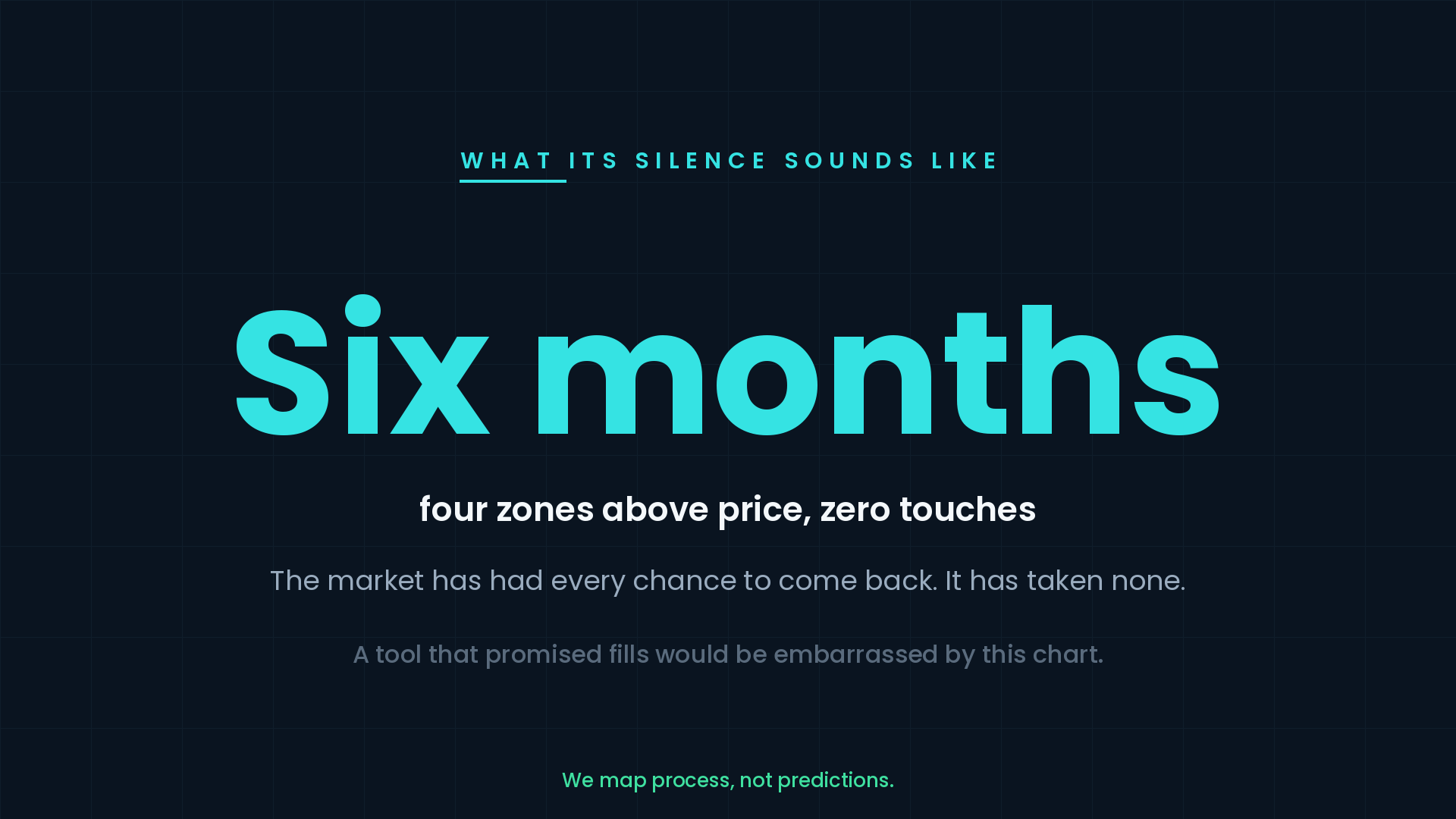
Four zones above price. Six months. Zero touches. The market has had every opportunity to come back and has taken none of them. At the bottom of the same chart, one green zone from the August low, six weeks old, also untouched.
The distance that remains
So the picture is lopsided in a way worth noticing: the market has cleaned out the middle of this range and left both edges alone — one unfilled area just under four percent below Thursday's close, the nearest one above eleven percent up.
A record, not a promise
A tool that promised fills would be embarrassed by this chart. A tool that promised a record is doing its job, and the record is the useful part. Six months of nothing is information about how the market is treating those areas. It accumulates quietly, and most tools throw it away.
Do fair value gaps always get filled?
Not on the evidence in this chart. Four red zones formed above gold in February and March and, six months later, price has not returned to any one of them. That is a direct counterexample to the claim that every fair value gap must be filled. Other gaps on the same chart did resolve, but their existence does not create a rule for the ones that did not. A gap records an area where price moved through quickly; it does not assign a deadline or an obligation to revisit it. Our explanation of what a fair value gap records sets out the distinction in more detail.
Last Sunday's question
We wrote down a question rather than a forecast: gold's weekly reads Recovering, silver's daily is the worst reading on our board — which one is early?
This week silver moved first. On Wednesday it printed an accumulation mark on the four-hour, a window that opened and shut inside two days. On Thursday it closed up four and a half percent, and the momentum line on our daily reached zero for the first time since February. Gold, on the same days, came back to the reference its July zone left behind and printed nothing.
That is not an answer. Silver's daily still reads Distributing and its accumulation layer has been silent for 689 bars. But it is the first real move in the question, and we wrote it down so you can check us next week.
Into the week
Blocks is free on TradingView, alongside Accumulate and Divergence — all three on the free tools page. If you add it, look for the grey ones first. They are the reason you can trust the red ones.
Something ships on Thursday. Next Sunday's episode is about what it makes of a chart like this one.
Educational market commentary — not financial advice.---
Read us first in your Google results:
Free on TradingView
Get the free structure layer.
Structura Accumulate marks where the market may be rebuilding structure before the move becomes obvious.
See the free tools