
Sunday Read #6 · The video version of this read is above; the text below covers the same chart, at reading speed.
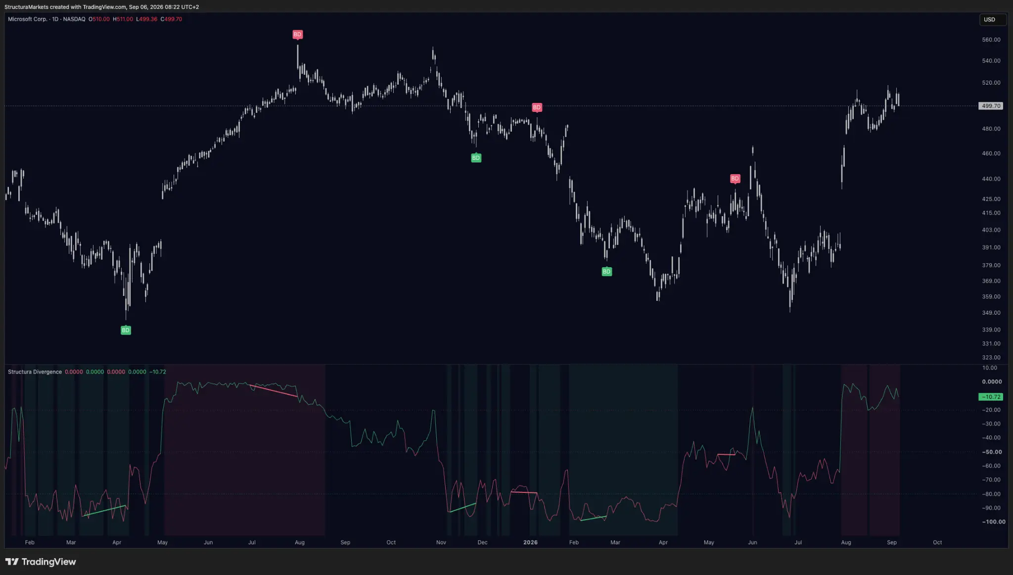
This is eighteen months of one Microsoft chart with every mark our newest layer has printed on it. There are about fifteen. One of them, at the top last summer, was followed by a decline of nearly two hundred dollars - the kind of screenshot that gets passed around. Several others were followed by nothing at all.
If the only one you ever saw was the first, you would think this tool tells you when a move is ending. It does not. It tells you something smaller and more useful, and the fourteen quiet marks are the reason you can believe it.
A new run starts here
For five episodes this channel walked through a method: how to read the table, how to name a disagreement, how to respect a phase, how to date a read, how to let the table choose your chart. That method is finished and it stays on the channel.
What starts today is different: one layer at a time. Six episodes, one tool each, and the same three questions asked of every one of them - what does this layer read, what does it refuse to say, and what does its silence sound like. We begin with the one you can already put on your chart for free.
What Divergence reads
One thing: the moment price makes a new extreme and the momentum underneath it does not agree. Price tells you where the market traded. Momentum tells you how forcefully it got there. Most of the time those two say the same thing; a divergence is the exception - the market reaches further than before, with less conviction behind it than last time.
There are four shapes, and the jargon is worse than the idea. Regular bearish: a higher high in price, a lower high in momentum - the move kept reaching and stopped being confirmed from the inside. Regular bullish: a lower low in price that momentum refuses to follow. Then the hidden pair, which describe a pause rather than a turn: hidden bearish is a lower high in price while momentum stretches higher, hidden bullish a higher low in price while momentum dips lower - the move takes a breath without breaking. Solid lines on the panel for the regular kind, dashed for hidden.
That is the whole event. Everything else written about divergences is somebody's opinion bolted onto it.
What it refuses to say
It does not tell you the trend is over. Look at the decline through last autumn: the panel marked disagreements repeatedly on the way down, and the market went down anyway. A market with less force behind it than last month is still a market that is falling.
It does not tell you when. Even where a divergence precedes a real turn, the distance between the mark and the market doing something about it can be a handful of bars or a full quarter.
And it does not tell you how far. Nothing about a lower momentum high implies the size of what follows.
So what about the famous one - the mark near the top last summer, the one worth roughly two hundred dollars? It is the same mark as the others. It was not better and it was not more certain, and we would be lying if we showed you that screenshot without this chart around it. A divergence that leads nowhere has not failed: it was never a promise. It marked a disagreement, and the market resolved it by continuing. That is one of the two ordinary outcomes.
What its silence sounds like
Most of the time this layer says nothing, and that is the normal state of a chart. The swing points it needs take time to form and can only be confirmed after the fact, which means every mark arrives with a delay and long stretches carry no marks at all. A tool that finds a divergence every day is not being sensitive; it is being loose.
One more property matters more than it sounds: once a mark is printed, it never moves - including the ones the market later made look silly. Those stay on the chart too. Deleting them would be trivial and would hand you a prettier picture; it would also make the record uncheckable, and a record you cannot check is worth nothing no matter how good it looks today.
Last Sunday's receipts
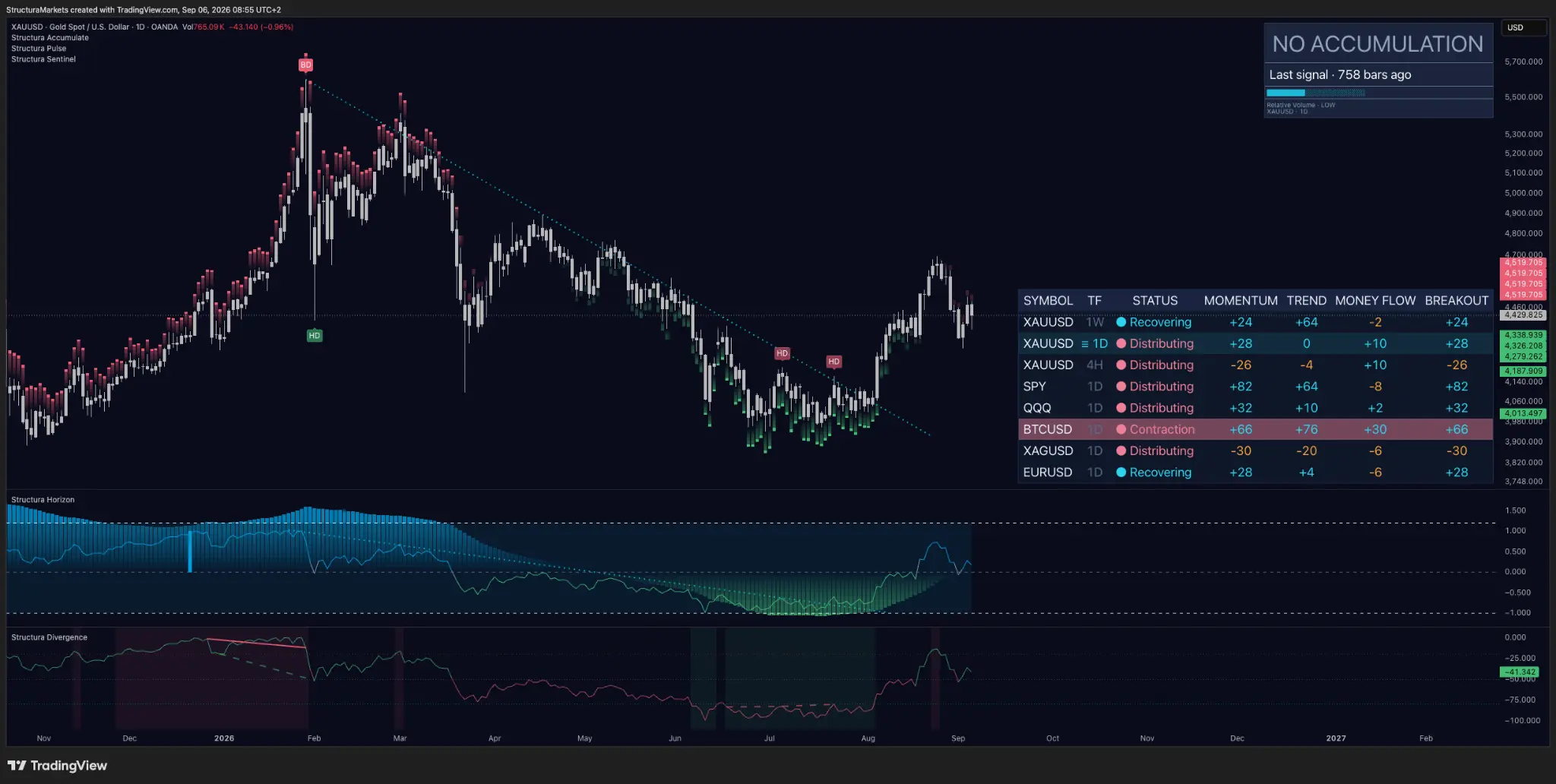
Gold. We asked whether the pullback would hold the line it broke, or hand the breakout back, volume and all. The answer is split, and the split is the interesting part. The line held - price is 4.8% below its August high and still standing on the level it took back three weeks ago. The volume did not. Relative volume has slid from medium to low and the four-hour label turned to Distributing.
Remember why this one mattered: of the three breakouts we tracked in August, gold was the only one that brought participation with it. That is what made it different, and that is the half we have lost. A level held on thinning participation is a weaker fact than the same level held on expanding participation - so the honest version of this receipt reads: passed, with the reason it mattered removed.
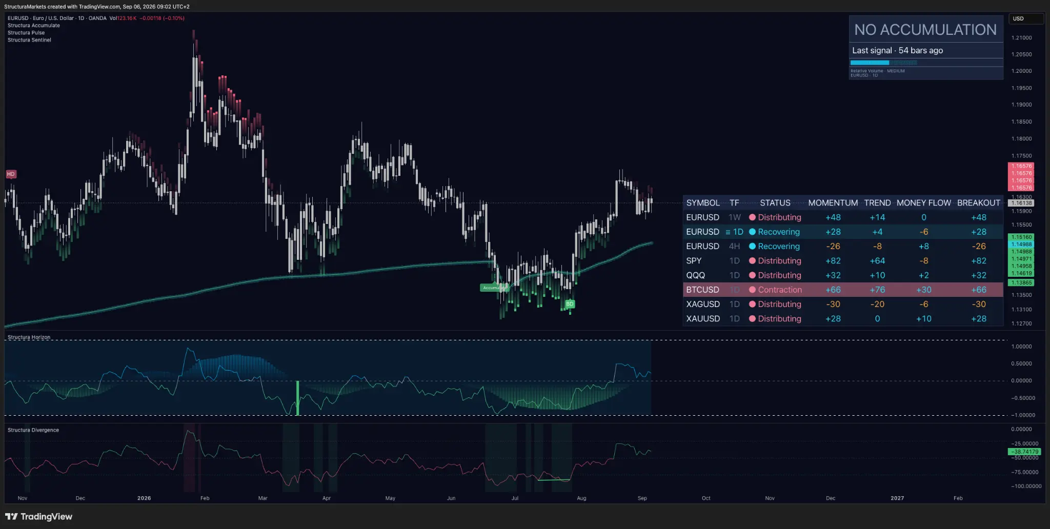
The euro. We said the zone had never actually been tested, and that price walking back toward its reference might finally ask the question. It did not ask. Price turned around and went the other way, and the zone is still sitting there untested, exactly as it was. Not every question we write down gets answered - and saying so is cheaper than pretending the market did something it did not.
Into the week
The index: momentum at +82 against money flow at −8, sitting at the highs. That is the widest gap on our board and it has been widening for two weeks. Does participation come up to meet the price, or does price come back to meet the participation?
Bitcoin: the label reads Contraction - compression - while its row carries the strongest money flow of anything we track. A market being squeezed and funded at the same time. Which of the two gives first is next Sunday's answer, not this Sunday's guess.
Educational market commentary - not financial advice.
Read us first in your Google results:
Free on TradingView
Get the free structure layer.
Structura Accumulate marks where the market may be rebuilding structure before the move becomes obvious.
Get the free structure layer